@jstrecker
I have what may be a naive question (I am not a designer): In UI design, how does one find a balance between the appeal of harmonizing the visual appearance of parts vs. the cognitive load of identifying the differing functionalities of parts ?
Are there UI design principles that guide such decisions, or does it have to be decided by usability testing ?
Great and important question !
I’m not a professional designer neither, only a hobbyist. I don’t know the « HOW » answer and I don’t know if there is a definitive answer to that (as @useful_design wrote) ! One thing I’m sure however, is that the balance you mention can be found ;)
I guess through discussions, tests, learning and inspiring ourself from others etc.
This is surely a sub-question of the big « Functionality VS Beaty » balance question of life. Yin & Yang, hot & cold, light & darkness … ;)
This has come up in some of the debate over flat design.
But this balance you mention isn’t isolated on flat design is it ? I think flat doesn’t necessarily mean over-simplified. Flat is a style, simple rather a method. I guess one can make simple skeumorphism and complex flat design ;)
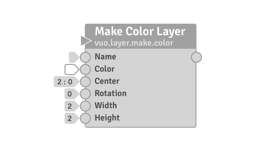
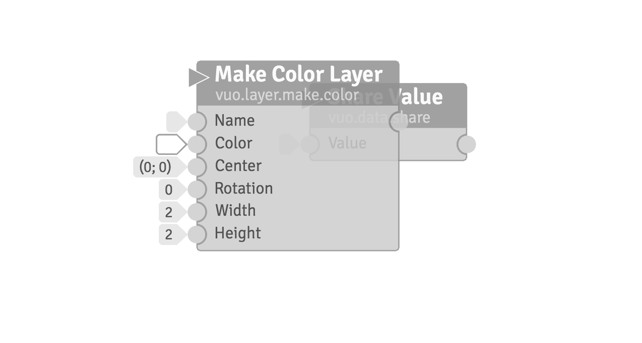
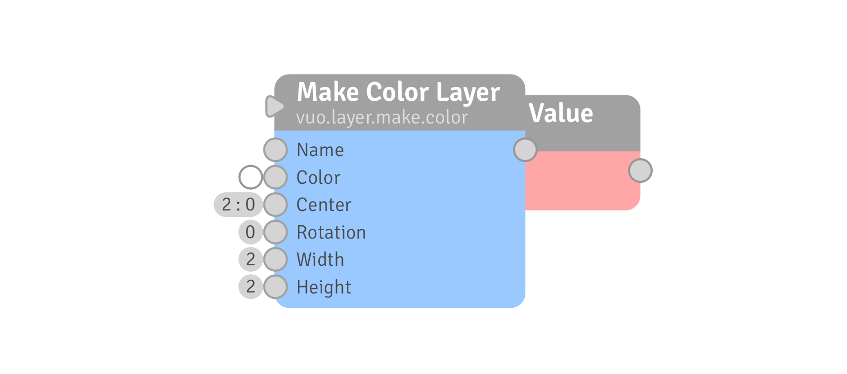
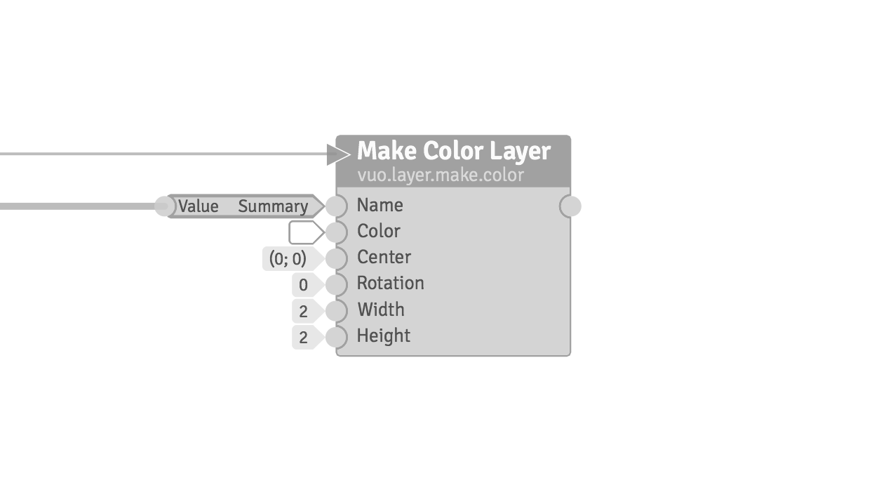
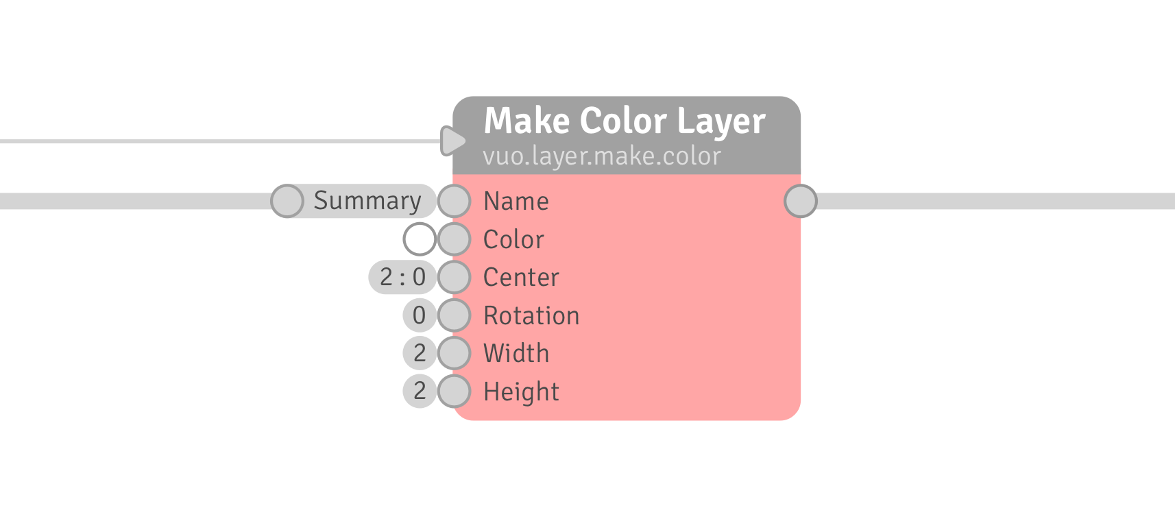
In terms of Vuo, I wonder, for example, to what extent event-only ports should be differentiated from data-and-event ports. Is there any way to tell in advance if changing event-only ports from a triangular outline to a circular outline would help or hinder usability ?
Don’t know. You think to put the triangle inside an oval would make it harder to read ?
I don’t like the actual triangle ports for several reasons, but they may be personal and subjective. I think it doesn’t fit with the actual node already. The actual node already has some slight rounded borders that feel so different from the sharp edges of the Event Only Ports.
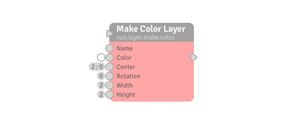
I don’t claim this design mockup is perfect or totally finished. Design will and has to evolve.
The triangle inside the oval was only a solution between others I came up later with because, as written before, I couldn’t get to make a triangle that would have a border, would be the same height and width as the other ports and would be rounded to match the style submitted here.
My mockup evolved as I understood how the actual node was built. The first mockup was a big rounded triangle. I realized it was too big, so I tried to shrink it. Then I realized the Editor had some borders implementation method I should try to make use of. I also tried to make a Event Only port that could be achieved with code only. I guess drawings are different from what you can achieve with code.
And that’s why I came up with the triangle inside the oval. That way :
- It would match the overall style and harmonize.
- Still be differentiated from the Data ports thanks to the triangle inside.
But any other ideas welcome.
I also keep in mind the thin cable for Event Only helps with reading the composition. Hard to oversee the difference between the cable thickness IMO.
Regarding @useful_design’s concern about Data Types
something else I thought might be useful in “reading” compositions was a set of symbols for datatypes that could at least be next to the node output ports. Symbols for Binary, Text, 2D point, 3D point, 4D point, List of…, Integer, Real, Enums (new datatype for UI elements), Mesh, Image, User authored nodes could invent datatype symbols for new datatypes or just use a generic “Custom” datatype symbol. This got argued strongly against at the time so I dropped it, but i think it would greatly help particularly new users and when viewing 3rd party comps and sub-comps.
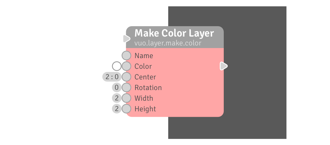
on this mockup the Fire/Event Only/Refresh triangle is inside the round port, one could imagine rounded ports to include some other symbols to notify the users of other stuff, like for example that a certain Data Type is set.
This would however be way less important for Data Types if Data Types could be automatically reset to default when disconnecting a cable or if being able to update itself automatically to the new Data Type when a different Type Cable would be connected.
The question somehow is « should we use unified rounded ports with different symbols in them for different stuff or should we use different shapes for all the different stuff we want to differentiate » ? Should we change the shape of the ports or should the round ports include symbols.
I like the idea of unified ports with symbols, as ports already use text, numbers and colors within them.