User interface (UI) node set — buttons, sliders, text/number boxes, menus

Hi, @blackburst. Sorry I didn’t get back to you sooner.

For Vuo 1.1.0, we’re planning to include some additional button options, like on/off buttons, and the ability to customize the appearance by providing images/layers to render.

Beyond that, we’d love to include more UI nodes. I’ve converted this to a feature request, so the community can vote on how we should prioritize it.

Some of the features I would like to see for Buttons are:

  • Pressed and Unpressed UI states
  • Image Skinning for each button state
  • Option for border thickness
  • Press/Release/Unpressed outputs
  • Option to make a button sticky vs momentary
  • More text formatting options including wrap and choosing the location of the text (over below/above etc.)
  • I currently don’t find “Icon” large enough. Perhaps if “image skinning” also supported transparency in PNG files they can be used instead.

I was really glad that buttons have been enabled and I’m looking forward to what can be done with them.

1 Like

Hey guys,

As this feature request is gaining more popularity, I wanted to share some thoughts about this exciting group of feature requests.

The first thing to keep in mind is that people want customizable stuff I guess ! (most comments mention that).
So I really think this whole UI thing has to be done the easy way and the most customizable way !

I tried to list all the different sub-requests mentioned here and split them in categories. Then I’ll try to share my thoughts about these and how I think things could be done.


So the difference things seen here are :

1 - Buttons :

   - Custom Styled buttons with :
       a - Borders
       b - Transparency
   - On/off States.
   - Pressed/Released/Unpressed States (with Image Skinning for each state).
   - Toggling.
   - Rollover.

2 - Other UI Stuff :

   - Checkbox/Toggle + Grid of Checkboxes (2D) Select Boxes.
   - Finder Windows.
   - Progress Indicators.
   - Sliders.
   - Text / Value Boxes.
   - Text Formatting Options.

   - DropDowns.
   - Momentary Buttons (Sticky VS momentary Buttons) & Group of Momentary Buttons.
   - Group Of radio buttons.

Ok, now let’s go this list point by point down :


1 - Buttons & Custom Buttons :

I think the actual Node could become a « Make default Button » node for those who don’t want to customize.

And that we could implement a new « Make Custom Button » node :

  • It would have a « Layer » input (Or Image).

  • It could have a similar Input for « Rollover and/or Pressed » states styles (however, modern Buttons are more about smooth animations).

  • With « Combine Layers » you could customize the button’s style the style you want (Including Text, Borders, Shapes, Colors).

  • The outputs could be
    a - Rollover.
    b - Pressed.
    c - Released.

  • On/Off and Toggling could be easily done connecting these outputs to the actual « Switch » & « Toggle » Nodes I guess !?

Concerning Borders. If borders could be added to layers (or images), then all buttons could have customized borders (I am going to make a feature request for a generic Add borders to layer » node and a new discussion about the way all the « Get layer » stuff is retrieved in Vuo. (See mockup Below).


2 - Other UI Stuff

  • Checkboxes & Select Boxes : You could easily turn a custom animated Button into a checkbox. Is it not the same ?

  • Finder Windows : A total yes. A browsing Finder Window allowing us to pick up some images, folders, files …

  • Progress Indicators : I think those can actually already be done. For example you can interpolate the width of a layer on whatever values !?

  • Sliders : Yeah Sliders ! Great ! But again, we will want to customize them. Customizeabled buttons and bars for them. However, wit some tricks this can actually already be done. Check out my composition here, it has some custom sliders (see screenshot below) and here is the link Composition Link.

  • Text and Value Boxes : Yes ! Definitely ! The big missing one so far to me ! But again, the need to be customizable ! For example a custom layer for the box + custom fonts for the text ! (see mockup below).

  • Text Formatting Options : There is a specific Feature request for text wrapping : Wrap Text Request by Teo Dumbski.
    Could we use that ? Or should buttons have its own possibility here ?

  • DropDowns : Mmm I can’t figure out yet how this could be done.

  • Momentary Buttons (and group of momentary Buttons VS sticky Buttons) : I don’t understand this part. If this is about vanishing buttons after they have been triggered, I think that specific Request about Disabling Nodes could be useful ? Disabling Nodes.

!Make Button.png

!Custom Sliders.png

!Tex Boxes.png

Can we also have a GUI or UI class set for the API? Would be interesting to allow people to re-use or remix the building blocks for easy GUI generation from within custom nodes. If this already exists please point me in the correct direction! :-)

[alexmitchellmus] Can we also have a GUI or UI class set for the API?

In the Vuo 1.1.1 source code, check out node/vuo.ui/vuo.ui.button.action.c — that demonstrates creating a layer group and adding rounded rectangle and text sublayers to it.

Going forward, I think we’ll start building higher-level C APIs for that stuff, since a lot of code will be reused between, for example, the (existing) action button and the (forthcoming) toggle button.

Great plan Steve. Should make it easy to build interfaces even inside custom nodes. (For high level logic etc)

Can they be skinable as well? (Custom gif etc). People can make the interface look like whatever they want?

1 Like

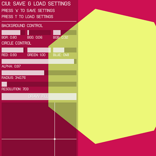
I am starting to really like super simple UI’s. Also from an implementation perspective it may be cheaper (load wise) to have a UI consisting of as many square edges as possible. Something like this looks lovely to me:

I understand that that is the LibCinder look, but something similar could be very classy for Vuo.

Link for ciUI: https://forum.libcinder.org/topic/ciui-a-user-interface-block-for-cinder

Chosen to be implemented.

1 Like

Great to see this has be chosen to be implemented !

Can we get some info on how the team plans to add and do this ? What sub-parts will be implemented and which not ?

Thanks ;)

Great to see this being implemented! I think this is a big feature request in and of itself — one of the biggest so far —potentially.

I’d love for community involvement, if we can get notification of the thinking and progress on this particular feature we can think it through with you. GUI elements was something I thought I would like to work on when I first heard about Vuo in pre-alpha days. I’m still not advanced in Vuo enough to have a go at this myself but have lots of thoughts about the challenges it presents.

For example, GUI elements lend themselves to fixed pixel dimensions even when the Viewer Window changes dimension. How does that whole can of worms get sliced and diced? Also what bearing does this have on the bigger discussion we had some time ago about Front Panel interfaces/VST type skinning for sub-compostions. What about GUI elements on the graph canvas itself… some nodal environments allows for sliders and switches on the canvas. Should we consider these bigger things when making what i assume are to become nodes exclusively for using in the Viewer Window allowing user interaction with the comp?

Given how much work Origami have put into this (bought half the QC team to do it by the looks) aspect of QC i think everyone should familiarise themselves with Origami’s features and ways of doing things as food for thought (perceived pros and cons i guess). The controlP5 library for Processing sounds pretty interesting too.

This would have big implications for people making open source software for public science type things I hope, (once the Vuo Editor has a free version and these nodes become free to use in that anyhow although an academic licence for Vuo is pretty affordable I think). Thinking in terms of MVC separation of code, we could have the model code in a Python app (or whatever) messaging with the view/controller code in a Vuo app. Done right it’s game on. Think how reusable display and GUI code would become with a full set of nodes and graphing/display sub-compositions! might even sell a few licences. unfortunately Mac only is a barrier to that crowd ATM. Compile to NaCL might solve it.

Can we get some info on how the team plans to add and do this ? What sub-parts will be implemented and which not ?

@Bodysoulspirit, we’ve made a plan and started implementing, but I don’t want to get specific on promises in case we don’t get to all of it in Vuo 1.3. We’re taking this whole thread of comments into consideration.

For example, GUI elements lend themselves to fixed pixel dimensions even when the Viewer Window changes dimension. How does that whole can of worms get sliced and diced?

Ew :P

@useful_design, like the existing Make Button node, the UI nodes will output layers, and will scale with the window’s width. Although we won’t get into advanced UI layouts/sizing for Vuo 1.3, the existing Arrange Layers in Grid and Align Layer to Window could help.

Also what bearing does this have on the bigger discussion we had some time ago about Front Panel interfaces/VST type skinning for sub-compostions.

None. Feature request?

What about GUI elements on the graph canvas itself… some nodal environments allows for sliders and switches on the canvas.

Ditto.

i think everyone should familiarise themselves with Origami’s features and ways of doing things as food for thought

How do you mean? My understanding is that Origami has a Button patch but none of the other UI widgets proposed on this feature request.

once the Vuo Editor has a free version and these nodes become free to use

Just to make sure this doesn’t become a rumor — Team Vuo doesn’t have plans at this time to make a free version. For info on how Vuo is funded, see The Vuo Story | Vuo .

Origami has a large set of basic and sophisticated touch/mouse interactions as native patches and virtual patches built on top of these Origami patches. While few of the proposed Vuo nodes are native Origami patches, the system is advanced enough to enable construction of pretty much any kind of nuanced interaction with feedback/animations during the interaction and recognition of state following that. Most things you would need for mobile app prototyping are doable if you make the effort (But i guess you could say that about Vuo already if you had all day to make a row of vertical value sliders).

In case of Vuo, feature set is more around controlling tools made with Vuo. Given that Vuo is significantly different to programming in QC, it’s not inconceivable that prototyping mobile apps in Vuo could become easier than it is in Origami/QC if there were enough nodes to support it, event based coding is more applicable to app prototyping than the hoops Origami needs to jump through to do what they do and track ‘state’ when you think about it.

So just from memory, what Origami calls ‘wheel or fortune’ type interaction (horizontal sliders with ‘sticky’ stepping values if you like see [Paged Scrolling example][1]) is one of the options in a prebuilt macro for horizontal sliding. I’ll check all the items in the proposed node list and find out if they are prebuilt or just potential to build. I can’t see one in that list that would be impossible to build, though the interactions in Origami are obviously more about prototyping interaction than controlling other things. Not sure what a “Select box” type of interaction is.

[1]: Origami Studio — Examples  

This is going to make interfacing with my VUO projects so much easier! Instead of relying on wireless Art-Net protocol and Luminair to make a less than ideal UI for my project I will be able to make a custom UI and use Duet Display to directly control it via a tethered iPad! I’m really looking forward to trying this out!

Keep doing what you’re doing VUO team because it’s awesome!

1 Like

Some notes on how we’re planning to implement this node set (to give more of an answer to @Bodysoulspirit’s question)…

We’ll be revising and expanding on the one UI widget already in Vuo 1.2, Make Button, as we add more widgets.

Currently, you display a button by connecting Render Layers to Window : Rendered Layers -> Make Button : Rendered Layers and Make Button : Updated Layer -> Render Layers to Window : Layers. That will still be case (although we might rename the Rendered Layers port, since it will be carrying some additional information).

Currently, Make Button has a trigger port that fires an event when the button is pressed. That will still be the case. Other widgets, of course, will have trigger ports appropriate to the mode of interaction.

Currently, Make Button has input ports Font, Color, and Height. These will be replaced with a single Theme input port. There will be a separate node that inputs such aspects of appearance and outputs a Theme that can be connected to multiple UI widget nodes, giving them all a consistent appearance.

For each type of widget, there will be a node to specify font, colors for various states (normal, hovered, pressed), corner radius, etc., and a node to build a fully-custom theme from layers.

Currently, Make Button only handles mouse interaction. We’re looking into supporting other pointing devices, such as Leap Motion. We’d still default to mouse interaction, but provide a Make Interaction node that can input the position and status from any other pointing device if you want to override the default.

So that’s an overview of our plans. I just want to reiterate that we’re considering all the comments on this feature request, even if I didn’t explicitly mention them.

2 Likes

@jstrecker great Jaymie !

Glad to hear a node to build a fully-custom theme from layers is on the roadmap !

I guess it is important that people can make it look like they need it.

Hope “border thickness” will be part of the appearance node you mention when you say “For each type of widget, there will be a node to specify font, colors for various states (normal, hovered, pressed), corner radius, etc., and a node to build a fully-custom theme from layers” as it seems that was mentioned several times by people in the comments above.

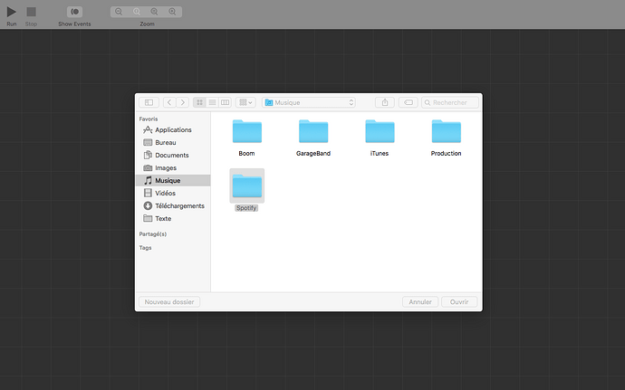
Any plans for a “Finder Window Explore” node to pickup stuff and retrieve their url’s like with “Get Drag values” ? Or do you already think this should be a different feature request ?

Any plans for a “Finder Window Explore” node to pickup stuff and retrieve their url’s like with “Get Drag values” ?

@Bodysoulspirit, we have plans for nodes that display a File Open dialog and a File Save dialog. They would have an event input port to show the dialog, and would output the selected file(s) when the dialog closed. Is that what you have in mind?

@Bodysoulspirit, we have plans for nodes that display a File Open dialog and a File Save dialog. They would have an event input port to show the dialog, and would output the selected file(s) when the dialog closed. Is that what you have in mind ?

Sounds great Jaymie ! Cool !

Yep ! Some Finder Explorer Popup similar to the one that comes when in the Vuo Editor you do “cmd-O” or File > Open Composition.

Hey y’all. I want to give you an update on what Team Vuo expects to include in Vuo 1.3 for this feature. Before anyone gets too excited, we are not on the verge of releasing 1.3. I just want to let you know, in the interest of transparency, which UI components we think we can fit into the next major release and which ones will have to come later.

Planning to include:

  • action button (like current Make Button but more customizable)
  • checkbox
  • slider
  • customizable appearance — including colors when inactive, hovered, or pressed; label font and placement; and corner roundedness

After the next major release, we plan to keep this feature request marked as “chosen” and implement more UI nodes. We won’t be able to do everything that has been proposed in the comments on this feature request, but we will try to pick the most popular and widely useful suggestions. We’ll let you know. For more advanced/niche UI functionality, you’ll be able to create additional feature requests.

4 Likes

Glad to see Fonts make the cut, hopefully for all UI element types Fontface is user assignable.

1 Like

Ok. Thanks for the update.

Maybe it would be cool to keep the “Notes from Team Vuo” on top updated in some ways, summarizing the suggested sub-parts, the chosen-to-be-implemented-next ones (:negative_squared_cross_mark:), the to-be-implemented-later ones (:white_circle:) and the tabled/refused/duplication ones (:x:). Tried to sum it up here (PS There may be duplicates within the list since I don’t understand some of the requests)

Main Button :
:white_check_mark: Borders option
:white_circle: Border thickness
:white_check_mark: Button Roundness
:white_circle: Transparency support for icon images
:white_circle: Larger icons
:white_circle: Different icons depending on states
:white_circle: Rollover/Pressed/Released states booleans
:white_check_mark: Rollover/Pressed/Released event outputs
:white_check_mark: Rollover/Pressed/Released skinning
:white_circle: Toggling output within the button
:white_circle: Text size scale with button
:white_circle: Text wrap option
:white_circle: Scale button to text width option
:white_circle: Support other pointing devices
:white_circle: Make custom button/UI element Node from layers
:white_circle: Make Theme Node & Theme port on Make Button

:white_check_mark: Checkbox/Toggle Button
:white_circle: Grid (2D) of Checkboxes
:white_check_mark: Sliders
:white_circle: Radio buttons
:white_circle: Group of radio buttons
:white_circle: Dropdown menus
:white_circle: Momentary buttons (sticky vs momentary)
:white_circle: Group of momentary buttons (menu)
:white_circle: Select box (same as Finder window?)

:white_circle: Text/Value Boxes
:white_circle: Progress Indicators
:white_circle: Finder File Open dialog window
:white_circle: Finder File Save dialog window

For me I guess it’s important that :

  • The texts/labels can scale with the buttons (:white_circle: Text size scale with button)

  • And (:white_circle: Make custom button/UI element Node from layers)

@jstrecker “For each type of widget, there will be a node to specify font, colors for various states (normal, hovered, pressed), corner radius, etc., AND A NODE TO BUILD a FULLY-CUSTOM THEME from LAYERS”.

Don’t know how this was planned to be realized, but it would be awesome. It would allow users that want deep customization to reach their needs before all the specific skinning sub-parts are implemented.  

1 Like