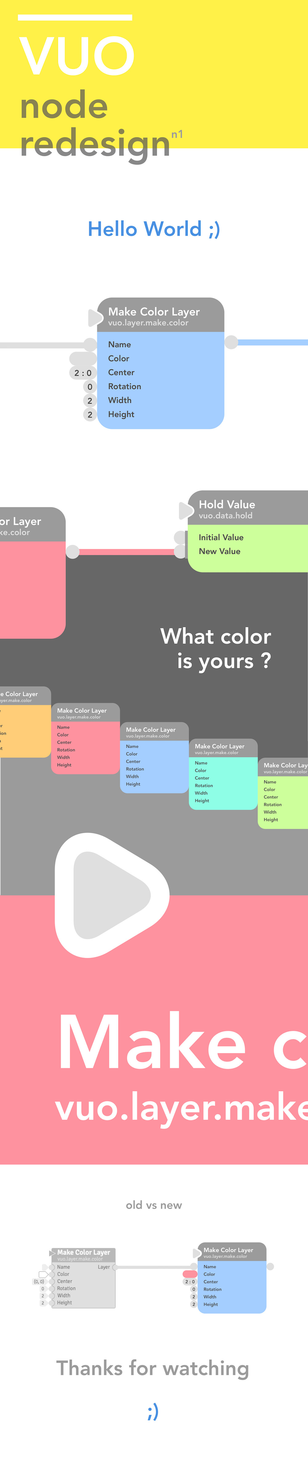
Hi guys !
Opening a topic for the design of the nodes here.
My first attempt here, may be more to follow.
Added a simple app in a comment below that loads the nodes onto a canvas as draggable layers so you can get a closer feeling Comment
Hi guys !
Opening a topic for the design of the nodes here.
My first attempt here, may be more to follow.
Added a simple app in a comment below that loads the nodes onto a canvas as draggable layers so you can get a closer feeling Comment
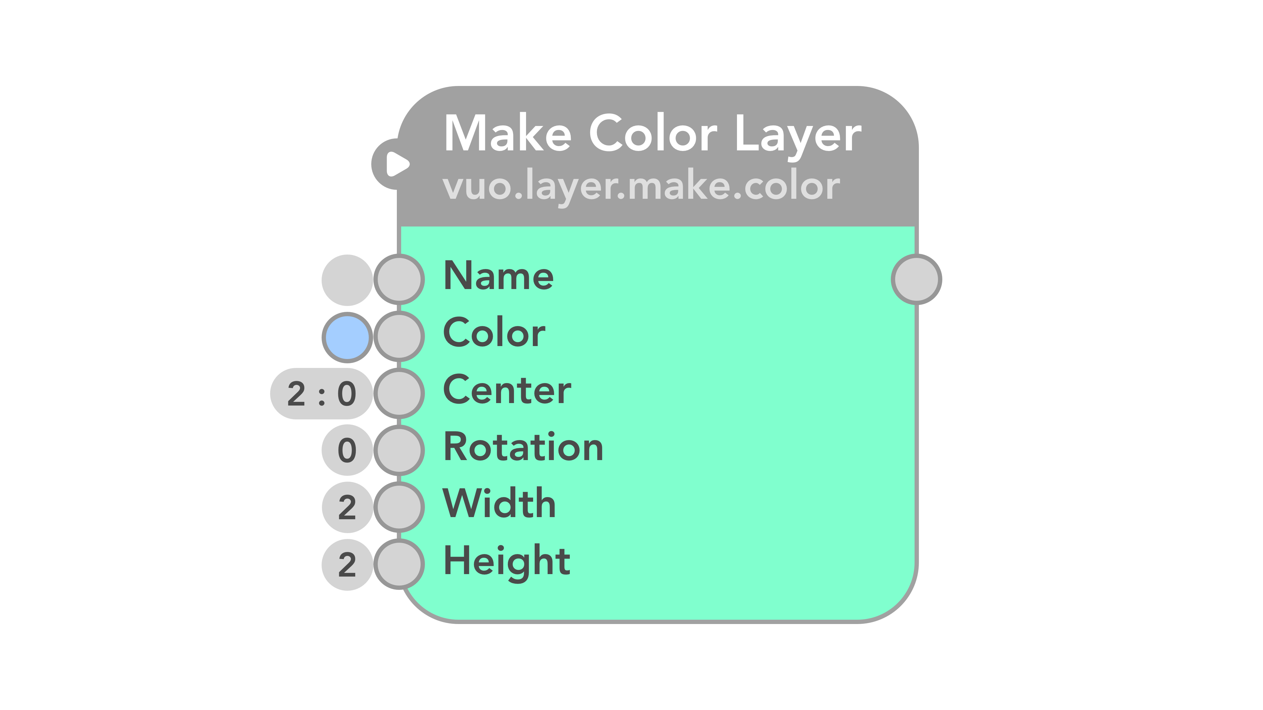
Unified cable port + value ports as when you connect a cable the value port disappear, no need for 2.
Even if “Show values even when cables are connected” is a feature request, one port is still enough as it could be expanded to show the value while having the cable connected at its end.
Made a simple app to play and get a feeling of the N1 nodes.
Move the nodes on a canvas with the mouse.
Keep in mind the nodes are exported PNG images loaded as layers in the app so the quality is scaled down compared to the .svg file representing the final quality.
PS : No cable or resize support on the canvas, just drag and move.
N1 Nodes APP.zip (8.89 MB)
I thought that the bottom bar denoted a state full node. One that stores data somehow to use. Such as Enque etc…
@alexmitchellmus ah ok. There was a type in my post, I thought that it was for nodes with walls. Will try to add an elegant solution then ;)
Hey people !
Exported the steps I made to get from the original node to the final result. Each step is small but still changes a lot and could be used progressively or separately as a roadmap.
I have updated the “Event only” ports since the original submission as I understood I had been drawing them too big, they should be no bigger then the data + event ports, but that sharp triangle is hurting my soul ;) I love it smooth and round.
Here we go …
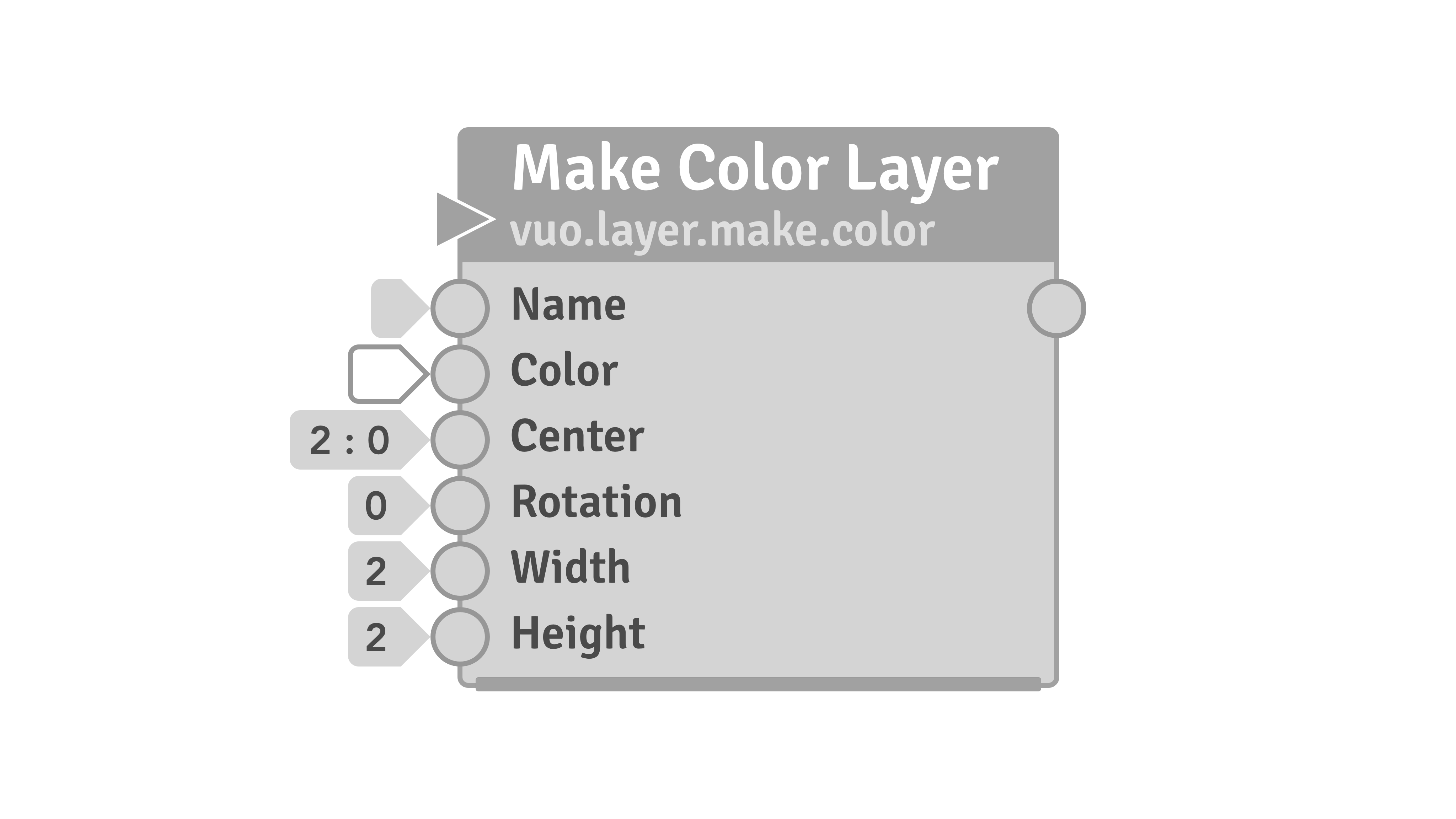
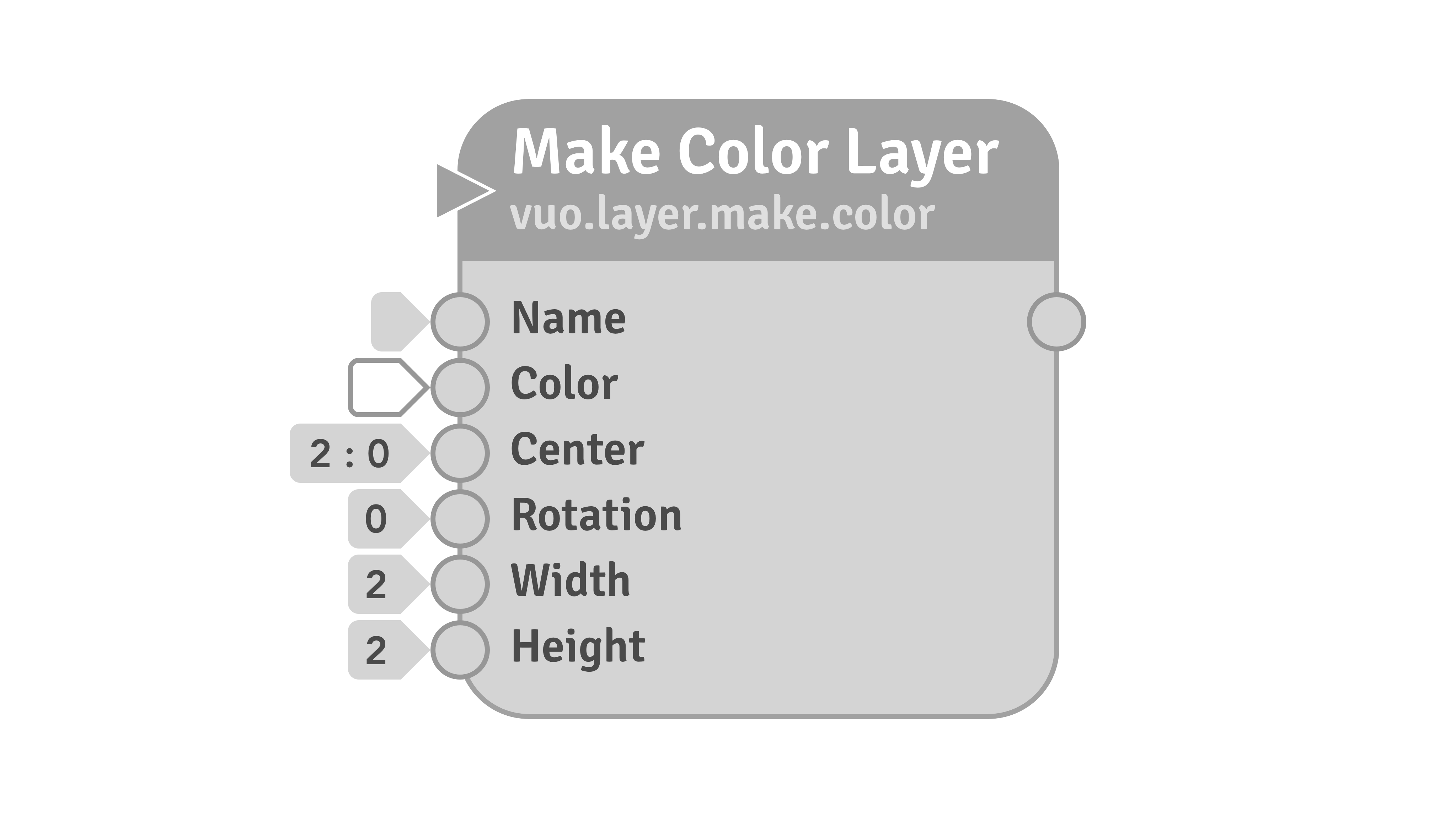
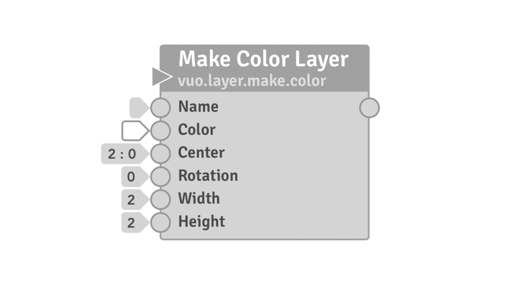
A - The Original Node I tried to recreate in vector drawing
B - Rounder Node + A little growth - No bottom wall bar.
I like both square and rounded stuff, but if I choose round, I like round roundness ;) 10 is too few to me. The node is slightly expanded to allow the higher roundness (just a little).
I also removed the bottom bar that displays a node with wall. I believe this is useless and only adds clutter. The walls on the ports are useful enough !
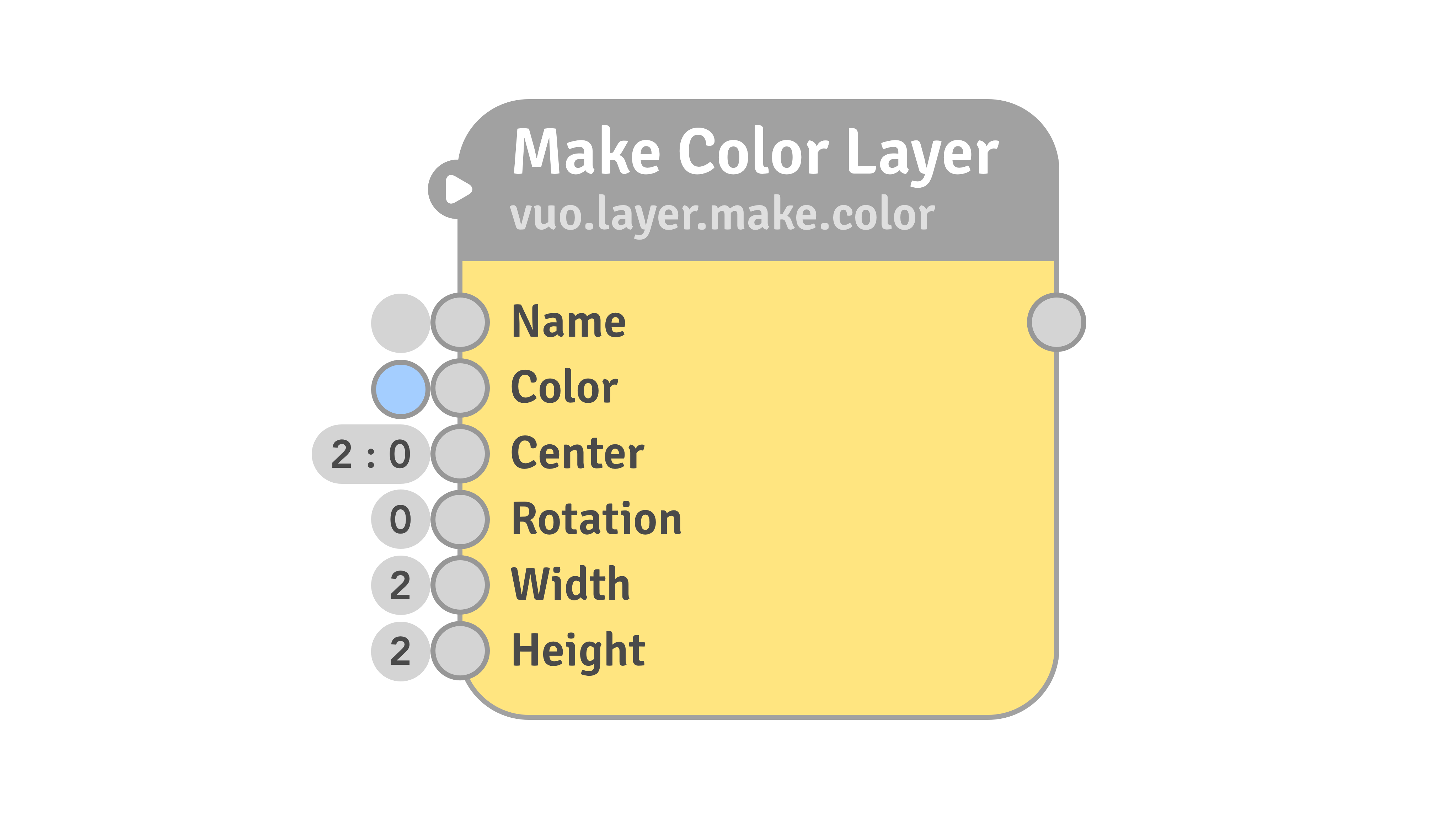
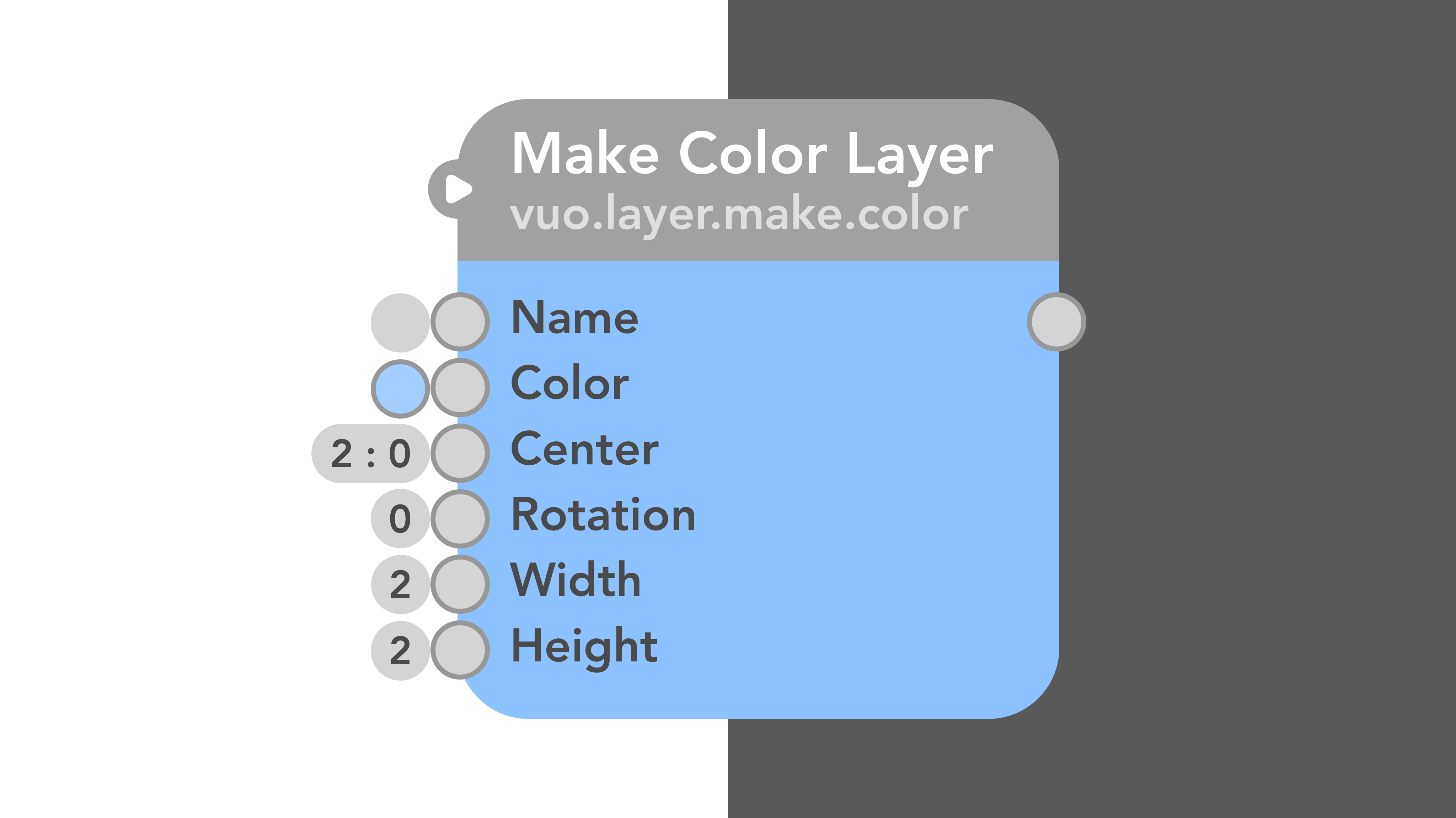
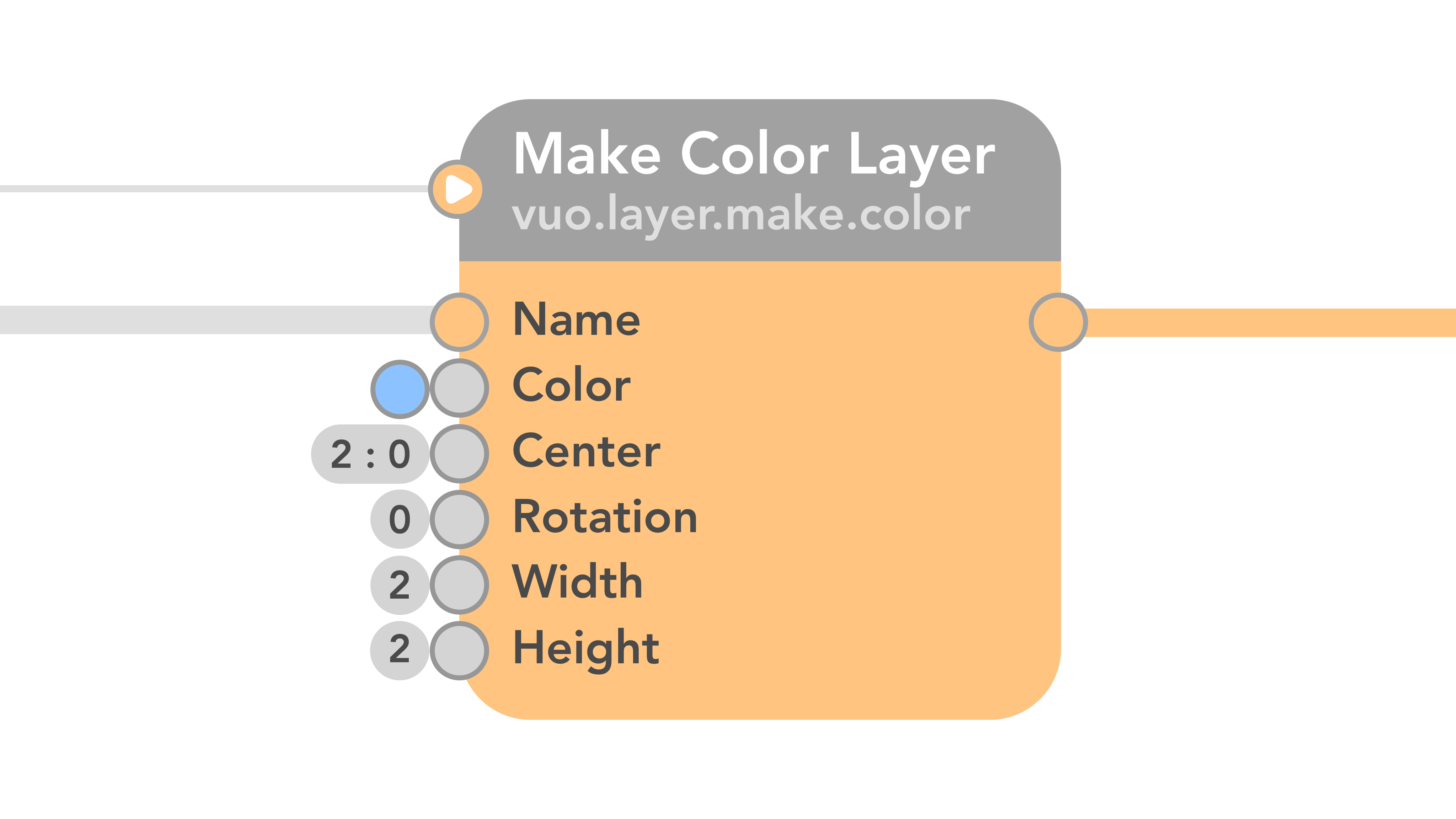
C - Colors
I’d use solid colors, with HSL in full brightness and a saturation of about 40-50 to ensure a good read on the port labels. I wouldn’t make the node transparent as they make the nodes look so pale :(
D - New Event Only port design + Rounded value ports.
As I couldn’t get to make a rounded triangle with his border for the event only port I put a rounded white triangle in an oval. That way the design is consistent with the other data ports but still is easily recognizable by the big triangle in the middle.
It is now aligned with the space line between the Node title and node class (the original Vuo node alignes with the top of the duo class characters it seems).
Same here. I’d prefer round borders for the value ports too (or go full square rather then 10px roundness).
I don’t know why the value ports would need an arrow shape on their right part so the port now is a full rounded square.
The value ports also have more equal scales. An oval for empty values and for single number values, expands on wish for each added characters.
E - The Font
I’d use another font for the nodes then Signika. One with less serif and straighter characters to get a simpler read. “Avenir” set in 'heavy" for example !
F - Removed the node borders.
No need to be. Moderner look without, looks great on both clear and dark mode (the ports still have borders here).
G - Colored ports on cable connection.
This is more about fun. Not the most important part to me but it would be cool if the connected ports would match the color of the node. Light gray for unconnected cables, color matching for connected ones. Has a functional use too though.
H - Unified Value Ports + Cable Ports.
OK this is the part that could require more work from the original nodes as it changes the place of the ports. so this could be added later.
As already written, I think those different ports could be merged as when we connect a cable the value port disappears. If the FR to show values even with connected cables would be implemented, the cable could just connect at the left side of the value port.
This allows to remove all ovals ports from on the sides of the nodes to ensure a simple and readable UI. The ports also have been expanded a little, they touch each other, no pixel between them anymore, an endless node hug ;)
At this level, the borders on the ports could be removed too !
Walls could be shown with just a bar of the height of the port inside the node (or outside, on the port).
My god ! Spent some hours of work here ! Hope you’ll like it ;)
I’m wondering if we still need the stateful indicator (bottom bar) on nodes. Starting a couple(?) releases ago, we made a lot of the image generating/filtering nodes (e.g. Make Checkerboard Image, Crop Image) stateful as a performance optimization. That this apparently didn’t confuse anyone suggests to me that folks aren’t using the stateful indicator as they “read” compositions. What do y’all think?
The big rounded corners on nodes are happy and friendly, but they take up extra space. Is it worth it? Thoughts?
@jstrecker made some comparison images.
1 - The node Width
The Width of the node could be even sized down thanks to the shrink of the arrow shaped port value boxes.
2 - The node Height
I guess the height of the node could be expanded by 1/4 grid height only.
Here is a sample mockup with the node size how it looks in Vuo on my 13" screen with the node zoom set to default.
Good work Christian. Will post some comments later — but wanted to say I did wonder what the bar on the bottom edge was all about.
@Bodysoulspirit I posted a while back in the UI thread an image of libcinders GUI elements. Although they are very sparse and dry, maybe something along those lines could work nicely? You are already on the same track with simplifying the nodes- I think a simple elegant UI could really make Vuo stand out! (I like the new 100 point roundness, maybe use this throughout the UI?)
I REALLY like the newest design above! Well done @Bodysoulspirit!
@jstrecker because I know Team Vuo has thought through everything- what was the original purpose for telling apart stateful / stateless? Currently I use it just to know what the node is doing (it remembers some value) but is there a better way to use it? You mention that many nodes were updated to stateful for performance reasons- so has it kind of lost its original meaning? The other thing is that if someone is really interested in what the node is doing- they can check out the source! ;-).
Maybe it would be better as I said before to place a symbol for stateless nodes?
After looking at the last design more- I think something needs to be done with the event triangle? (Don’t know what though!)
@Bodysoulspirit have you though of designing a matching UI set (for use within the new UI Node?). I really like your simple clean design!
@jstrecker thanks for comment ;) Appreciate you read the topic and watched the ideas ;)
Stateful indicators are not important to me. I don’t even know that is what the bottom bar was for ;) But that’s my opinion. I’d be happy to hear if other users need it. Could try to design another solution then the bottom bar or try a redesign of it.
The rounded corners added pixels on the node size but not that much. Will add an overlay image of the 2 to get a better idea of the difference. Will also try a real square redesign.
Combining value + cable ports would also reduce the node’s size ;)
I tried to sort the steps on how much they added and changed the nodes : rounded corners, colors, event only ports …
Can also send the team the vector files.
@alexmitchellmus thanks man ! I really appreciate the kind comment !
Yes an unified UI is something important in a software. I have made some custom editor buttons and some stuff for myself.
I will try some projects and mockups for the editor when I have time, takes a lot of time ;)
Yeah I remember your comment on the lib cinders GUI in the UI Feature Request. Another style, even flatter, all in square. I like it too. This was an attempt to roundness here, and I will try to add some other UI parts on the same style in this thread, perhaps we should separate topics by style, like you could create a flat square design one ;) Perhaps will try one too.
Design is very subtile and subjective and always evolving. Guess in a far feature it would be great to get some customization options to match all users styles with some node roundness options, opacity, perhaps font, custom canvas backgrounds with tiled images, whatever, but I guess there are some more important stuff for Vuo in a near future.
Just wanted here to give the default nodes a fresh look too and tried to match the flat and simple UI we see a lot nowadays. I personally love those a lot ;)
Thanks again ;)
@Bodysoulspirit, yeah, the “to be implemented” UI nodes for “buttons” “sliders” etc would look great with this UI design. I don’t think square would be good- but clean curves like you have and block colours is fantastic!
@alexmitchellmus thanks. Don’t know what the example default UI parts will look like with that feature request but @jstrecker recently commented there with some good news : customization ! ;) To satisfy all the tastes ;)
Comment on UI nodes … here Jaymie’s comment
If one would want not to increase the size of the node at all, one could still find some in-between solutions. So that it wouldn’t look as good to me, but still pimps up the node in my opinion.
The node size was increased for 3 reasons, first for more node roundness, secondly to increase the line between the node title and the node class and at last to add a little spacing between the port labels and the node bottom and top.
If I remove those and keep the orignal spacings, and reduce my node roundness down by over 75% to get a roundness of 100 points (on my remake of the original node I got smtg like 30 points on the original Vuo node so this means I somehow do 3x the original roundness) I still can get something to look pretty in my opinion ;)
See the images below, the gif to shows the nodes have the same sizes :
So these changes include :
This doesn’t include other things I’d consider like another straighter font, some spacings or unified value + cable ports.
@Bodysoulspirit, I appreciate all the effort you’ve put into this, particularly in trying out mockups with different parameters.
I have what may be a naive question (I am not a designer): In UI design, how does one find a balance between the appeal of harmonizing the visual appearance of parts vs. the cognitive load of identifying the differing functionalities of parts? This has come up in some of the debate over flat design. In terms of Vuo, I wonder, for example, to what extent event-only ports should be differentiated from data-and-event ports. Is there any way to tell in advance if changing event-only ports from a triangular outline to a circular outline would help or hinder usability? Are there UI design principles that guide such decisions, or does it have to be decided by usability testing?
what was the original purpose for telling apart stateful / stateless?
@alexmitchellmus, the stateful indicator was part of a larger effort toward being able to “read” a composition’s functionality entirely from the canvas so that you could tell exactly how it would work without having to go hunting for hidden settings. Some parts of that effort worked great and we’ve kept them around, e.g. displaying constant values on canvas. Other parts did not work so well, based on the feedback we got about “visual clutter”, so we eliminated them and no longer have a strict every-setting-is-visible paradigm.
Currently I use it just to know what the node is doing (it remembers some value) but is there a better way to use it?
Not that I know of. That information is also in the node documentation.
You mention that many nodes were updated to stateful for performance reasons- so has it kind of lost its original meaning?
Yeah.
And yes, interactive mock-ups do take a heck of a lot of time Christain! I tried to mockup sub-comp inside parent comp as window in window back in the day using QC and it was a shit-fight getting QC to stay responsive and not grind to a halt or not behave in flaky way.
I have what may be a naive question (I am not a designer): In UI design, how does one find a balance between the appeal of harmonizing the visual appearance of parts vs. the cognitive load of identifying the differing functionalities of parts? This has come up in some of the debate over flat design. In terms of Vuo, I wonder, for example, to what extent event-only ports should be differentiated from data-and-event ports. Is there any way to tell in advance if changing event-only ports from a triangular outline to a circular outline would help or hinder usability? Are there UI design principles that guide such decisions, or does it have to be decided by usability testing?
There’s no one particular principle i can think of which adjudicates on this matter, and even if there were, design has many manifestos and philosophies around how function and aesthetics should be done. I guess that’s what makes design interesting. In Architecture people have spent their whole lives developing concepts around the fusion and/or disruption of functional, cultural and aesthetic needs/traditions/principles.
One of the better known design schools of thought in the digital world is the 20s/30s German Bauhaus school of early modernist design synonymous with minimalism and and the industrial aesthetic. In this school, less is certainly more (an ideal of Mies Van De Rohe the third and final Bauhaus director ). But that less is often an excess of materialist delight, extreme engineering feats (big column spans, mullion thinness, big glazing dimensions, self-supporting circular staircases –> SJ etc etc) and luxury, not an interest in efficiency per se. Or, paradoxically, even functional effectiveness much of the time. When we talk of reading a design, it has a specific meaning in Visual Programming, as we’re actually trying to read the code (not read it for beauty or semiotic delight) and what for one person might be a ‘linguistic aid’ to parsing the composition will for another person be clutter. Just as there are many coding styles in text programming although most agree spaghetti code is bad, which QC and Vuo can start to appear like without macros/sub-compositions and a sense of flow and order in the layout. People like Jonny Ives, Jobs etc first received Bauhaus through objects like the [Braun calculator][2] and the Dieter Rams catalog has become something of a temple of design sense at Apple and elsewhere because of it. Of course in the Architecture world things have well moved on from Bauhaus/minimalism completely (rejected in 80s for it’s coldness and banality in the hands of the many) but it’s still going strong in ITC (and graphic design more generally to some extent.)
So with that little historical interlude, i’d suggest that it really depends on your perspective, but I want a UI/UX to work nice (functionality is fluid and somewhat anticipatory of my needs during interaction events), look nice (just as attractive to the non-user as the user would be a good starting benchmark), behave nice (no gotchas and over-sensitivities or peculiar hangups (persistent datatype locking for example on Share Value node with no visual cue as to the datatype mode it is in)) more so than I want to get more on the screen or follow some in-principle overarching style rule or dictate.
To me using more screen real-estate to do things nicely is okay, and that’s often the trade-off often comes down to — @jstrecker mentioned it above. I don’t want wasted space, but i don’t consider nice design a waste of space. I’d love to see QC style macros or (double clickable) local sub-compositions that behave just like they do in QC to solve space and readability issues first up. Is that a feature request yet, because I made a presentation on it for Vuo that i’d be happy to post for a discussion start point?