What, you don’t think Vuo needs a cute animal mascot? ;)
;) Hehe. Don’t know. I looove animals, I love them so much that I’m a vegetarian ;)
However, for the logo, not sure.
I’m not a pro designer neither at all, just a hobbyist. And when I look at some logos, from more or less related softwares, I don’t see a mascotte or animal in the logo.
Neither do I personally know of logos with animals for softwares, beside aquarium screensavers. False, I know Mediamonkey as a media player but not so sure people still use that one ;)
So I originally would not have added some, but actually it does sound like a possibility.
Let’s say this, if the Team wants a Mascotte, because they like it, sounds good.
If it is to metaphor how Vuo works, not so sure how much it will help people to know how it works.
I will perhaps try to make a logo with a jelly or an octopus. Or if the team likes one of my logo and just want to add a mascotte beside it, sounds fine too.
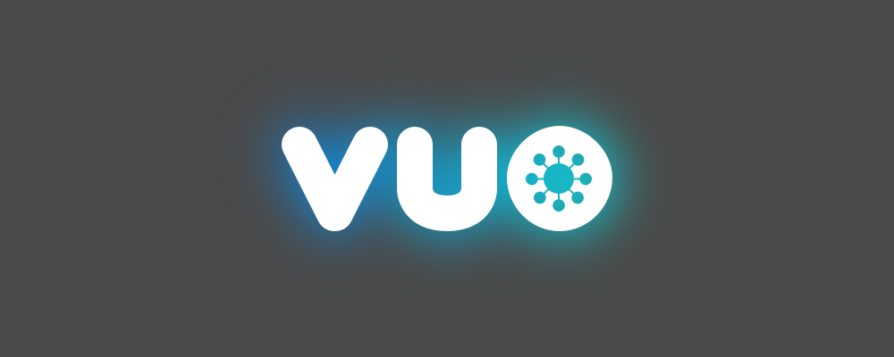
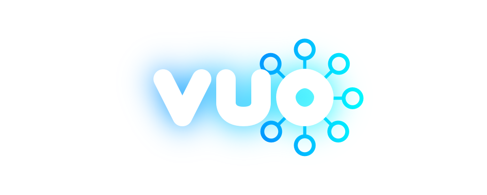
These are also about Vuo being a hub connecting various technologies. And maybe an optimistic sunrise?
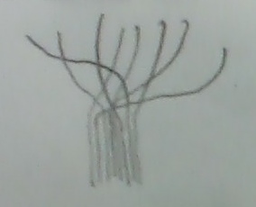
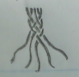
Not sure about the sunrise, what it has in common with Vuo, but I like the Hub. The connection, the dots, the cables. I just haven’t been able yet to make a good looking one where the cables are more expressive than in the one you mention with “flow pipes” in
Flow, like through pipes.
Yes, that’s what I tried with
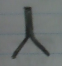
However, the problem I’m having with my own logo on this one is that the general feeling is more of the mouvement of a snake, rather then water IMO. Don’t you think ?
Building upward (the letters stacked vertically). Also a different play on the idea of flow: water rippling outward.
;) Haha ok. I had not even seen those where letters stacked up vertically ;) Not so very clear IMO.
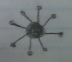
@Bodysoulspirit, you’re liking the dots :) Can you talk about those? Anything else you want to add about your thought process ?
They originally where meant to represent some data flowing through the pipes. Although I admit that could be obvious in
, but not in
!
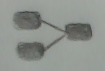
In
they just have an optic goal ;)
A question, when could you imagine changing the logo ? Vuo 1.3 already or later ?
PS : @jstrecker sorry to ask but would it be possible to refer to the logos with links (sat some unique names for them all) instead of images / cropped reuploaded images ? Once the new logo will be chosen I may want to remove the unchosen images / projects and use the ideas for some clients / other projects ;) Thanks

 (VDMX)


 (Max)
(Max)
 (TouchDesigner)
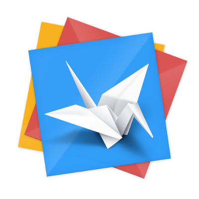
 (Origami)
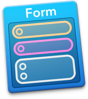
 (Form)

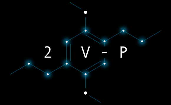
 (Processing)


