I have some data that is currently a series of straight lines on a graph. I’d like to
- load the data from a CSV/Excel/JSON file (i can wrangle it to anything but CSV is easiest I think)
- convert the data in the matrix to screen appropriate (X, Y) coordinates
- create a loop that can time sequence through rows of the data file and interpolate the values for each column value across each iteration of the loop
- create a smooth curve from resulting set of (X, Y) coordinates
In QC this would be pretty easy work for me but I’m a Vuo newb, could anybody get me started on any of asks 1-4?
I’m kinda in a hurry and would normally go straight to QC with Kineme data tools and 2D drawing plugins but the Kineme Spline line patch creates weird kinky loops on the line near the end points (for no apparent reason) so I determined it was unusable when I tried it a while back. I could do manually in After Effects but the idea makes me scream when I could make it in QC/VUO/ORIGAMI.
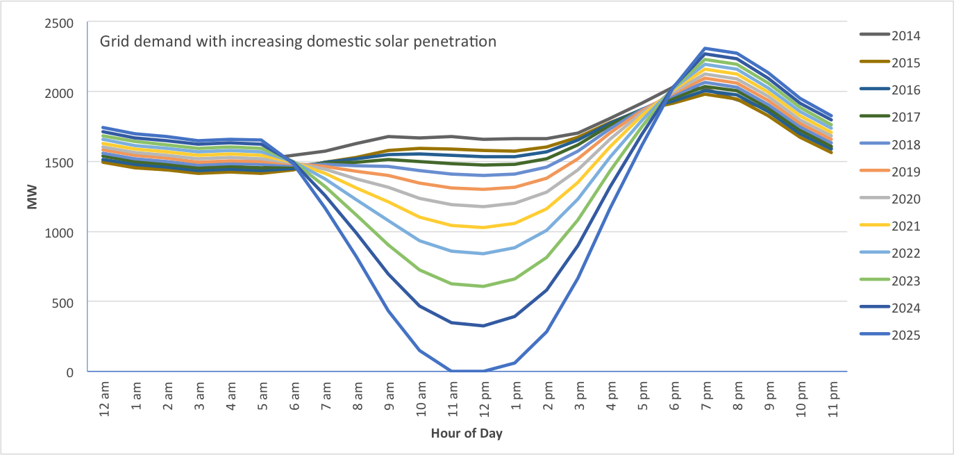
I’m just animating the Duck Curve graph if people know what that is. A time sequence of modeled data for daily demand curves across a series of years. So one coloured line becomes the next through interpolation in the illustration below. And smoothing as a bonus would be nice to have (and interesting to see the performance hit too :-) )
Link to CSV File of Data (4KB)
If someone can get me a demo of something doing this with some data I can make all the grid lines, labels bells and whistles. Just knocked this up in AE:
(can’t get this tiny video to either upload to vuo.org as a .mov file or use a YouTube link… it uploads and then on the last question and button gives error screen)
1999 alt - YouTube
Here is a animation of the data generated in Python but i want to do something prettier. It actually is grabbing minimum (green line), maximum (red line) and calculating average demand (black line) for each year, would require 3 sets of data and some way to fill the regions (not sure how I’d shade the complex regions b/w red and green lines in Vuo yet).
So I can load the table and append all the header text from the first row into a single text item and that’s about it so far.
How do I rotate a text layer?!
I used a 2D Transform node and although it will translate (X, Y) it will not scale or rotate the text.
No idea what I’m doing wrong, how hard does rotating a single “Hello World” by 45º have to be?
In this vuo file the filepath to the data will have to be updated to wherever you put it. Just drag the CSV file into the composition and a new Fetch Table node is created with the correct URL.
Here is the CSV file again, zipped this time to get it on the VUO server
minimum_swis_load_21.2V2c.csv_.zip (2.63 KB)
Animate CSV as smoothed line plot.vuo (6.95 KB)
1 Like
Looks like you figured it out :) — Composition: Graph Animation
Yeah, thanks Jamie, my only two issues to finish this composition /tool for it to be usable are:
- A) the spline and line nodes have gaps in when the line into a point and the line out are not at 180º (or put another way parallel) the more the angle opens up the, more it exposes a lack of chamfering or nice corner treatment (like a circle the diameter of line width) as discussed on the FR somewhere (I think I added it to the Polyline FR).
- B) most of the things I tried to put in sub-graphs I couldn’t due to the event propagation issue which I believe will be ‘fixed’ or updated in the next version of Vuo.
I’d really like to see polyline with corner treatment like Adobe Illustrator and/or CAD software. And fill region inside polyline (maybe with odd/even or overlapping solid/empty treatment) would be great too. It’s pretty hard to mock that up without custom writing a node the divides a polyline region into triangles or something.
Late to the party as always, but found this to be quite interesting to look at. Haven’t yet had time to look into the new data options in 2.6, so this was a good opportunity. I took the liberty of simplifying and reducing resource usage of the core composition/animation, and stuffed it into a ‘Build List’ node to do most of the work, enabling a calculate node fitted with a lerp function (this doesn’t exist in a dedicated node for lists (yet?)) to do the morphing.
The smoothness issue is probably because the lines get drawn as rectangles (probably called something more professional sounding). As it is the center that is at the coordinate provided, this means that the rectangle will “break” at the outside of sharp corners if it has a large line width. I find that upsampling and adding a modest blur, together with a high sample-/point count to begin with makes for a better result. If you are careful with the event flow, it’s even possible to run it at an acceptable level of resource usage. No need for unnecessary events - “Allow Changes” is your friend!
A few notes on usage: You probably have to re-drag the csv file to the ‘Fetch Table’ URL. If you use a different table, you also probably have to change the max value of the Morph fader in the input section to correspond to the data set (this can be calculated). The ‘Wave’ node is in this concoction essentially just acting as a fancy modulo node. This can be replaced with any other time based node (smooth or curve for instance?) with a duration set to 1 for different morphing motions (and control!).
Magneson.GraphAnimation.vuo (13 KB)
1 Like
Hey thanks for taking an interest @MartinusMagneson. I can’t get you composition to display anything. It’s loading the CSV and making the points but no images at end of the pipe. (QC is nice in that you can hover over an output port and see a little preview image).
Hmm, that’s weird, it loads fine here, can you try the attached file? It has a lower initial resolution, only 8bit color depth, and has multisampling off.Magneson.ReasonableGraphAnimation.vuo (13 KB)
This composition draws a blurry line. Not sure how it relates to the data thought at first glance. So edited that one to have same resolution and colour bit depth and multisampling as the first composition and again no image. I cannot handle 8x multisampling with the other settings as they were in first comp. To get the composition to multisample at 8x for that resolution (3840 x 2160 px) it needs to be 8bit colour, which is fine for a graph actually.
I’ve got a AMD Radeon R9 M370X 2048 MB on a late 2015 MBP, I’d have thought it could take anything Vuo could throw at it, even if it was slower than some cards.
What are GPU a you using?
I didn’t dive into the presentation part of it, so this was more how I’d animate the line morphing. The LERP function in the calculate node is probably the most important part of the whole comp. Looking at it, the graph is also wrong! I hadn’t cut out the first row and column, so the graphs includes the month/year when calculating size. For presentation data (scales, info), I’d also opt for a build/process list angle as it keeps things clean and workable. If you have to use a bunch of ‘share value’ or ‘select input (8)’ nodes, chances are you’re better off using the list nodes.
I have a crappy Intel Iris Pro (decent cooking apparatus), but I know there were some issues with the multisampling long time ago for this card, so maybe it is just ignored. The upsampling is the important bit anyway, as a blur radius of 4 is quite heavy at 1080p resolution - not so much with 4k. The bonkers quality settings otherwise is also mostly to demonstrate how a rather heavy load won’t bog down the computer if the event flow is carefully constructed/limited. Then you can deal with a much heavier texture/calculation than you’d be able to if everything were triggered all the time.