Dark Mode
I think a good point here is that Vuo should sparkle for any trial user, i.e., choose the most beautiful layout possible as the default layout.
Dark Mode
I think a good point here is that Vuo should sparkle for any trial user, i.e., choose the most beautiful layout possible as the default layout.
Of course I’d love a big redesign at once, just think I’d not want next Vuo versions to be delayed to much because of that and have fewer features because of it.
Plus if a big redesign occurs at once, it has to be almost perfect, because how pity would that be if the team spent much time on it and then had to take steps backwards or make huge changes again.
I don’t think Vuo’s design looks really worse then the original QC’s (and QC has a lot of user) !
And I prefer it to Pure Data or Max.
Vuo also has more things shown on the nodes, so it’s more work to make it look good. The less shown, the easier it is to make it look good.
Touch designer has some square nodes, old school purist style, with great cable colors.
I think Vuo can get lost of both worlds and stand out.
If I compare it Vuo to QC, yes I slightly prefer QC’s design, but it’s not only about the node design.
I prefer the font (and even if the node roundness is rounder, I don’t think they look toyish, Signika looks a bit toyish in my humble opinion).
I like the Icon better.
The Editor seems a little flatter and moderner.
It’s smooth and fast, smooth scrolling, smooth zooming, smooth node library.
The sub-nodes just work, fluently as heaven !
Origami made a good job at the moment the interface was getting old, straight cables etc.
Attention, I’m not saying QC is better !
It has tons of bugs too (increasing).
Custom patches have to installed for exported apps (Vuo includes them).
No team support.
No big updates with big new features.
So just wanted to add some arguments about design important, but not only.
Design is also not only in the editor, the emails count too (missing images in email notifications, ratio false resized images in week letters), the website, tutorials and update videos could be made better IMHO, etc.
At this point Vuo does great things QC does not (and probably never will, can’t compare to other apps I don’t use them),
QC does some things Vuo can’t (yet !),
But soon, thanks to this community and the team working with the community, soon it will be better then QC in most all of its aspects ! ;)
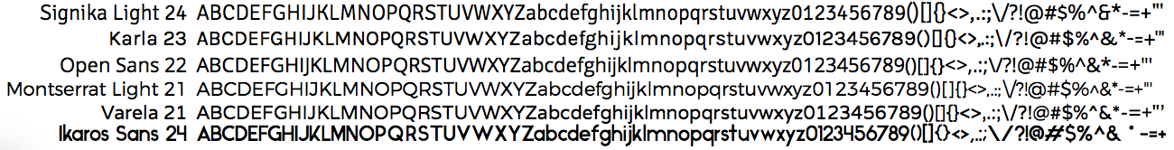
regarding the fonts you have tried.
i like the open sans, Varela and Karla.
The other fonts are too hard to read (in my opinion).
I have used the “Droid Sans” and “Ubuntu” (mentioned in the article linked below) a few times in Webdesign and i really like them.
Since they are used in other widespread Software (Android and Ubuntu ;D ) they arent really an option. But something in this direction would be nice to see.
The current font used in VUO is also nice. Maybe just a little too bold and a bit too “playful” for my taste.
This article sums up a few important points about UI Fonts: what-should-i-look-for-in-a-ui-typeface
@iason yeah you actually quite right, Open Sans is easy too read too !
Was not the one I liked most at first sight, but actually quite like it though after all ;)
I get a dead link right now for your link, perhaps temporary.
Thanks for your feedback.
Yes, but don’t you think some other don’t (yet) use Vuo because of the lack of features too ?
@Bodysoulspirit, that’s certainly true.
Plus if a big redesign occurs at once, it has to be almost perfect, because how pity would that be if the team spent much time on it and then had to take steps backwards or make huge changes again.
Maybe what I should be saying is: we’d like to make a coherent set of design improvements, enough that the change would be obvious to someone opening up the new version for the first time, and we’d like to tackle some of the more difficult changes like cable paths rather than sticking to super-quick ones like tweaking font sizes.
Instead of doing static mockups If I was pointed out with a tutorial how to try live redesign with either QT or scripts (as Alastair mentioned if I’m right), how I could tweak the code of the nodes etc. But perhaps it’s part of the proprietary editor code, don’t know.
As I mentioned here, it may be possible to play with the stylesheet.
Vuo’s renderer code and vuo-render command-line tool are open source.
This article sums up a few important points about UI Fonts: what-should-i-look-for-in-a-ui-typeface
@iason, thanks for sharing that. (The link worked for me.)
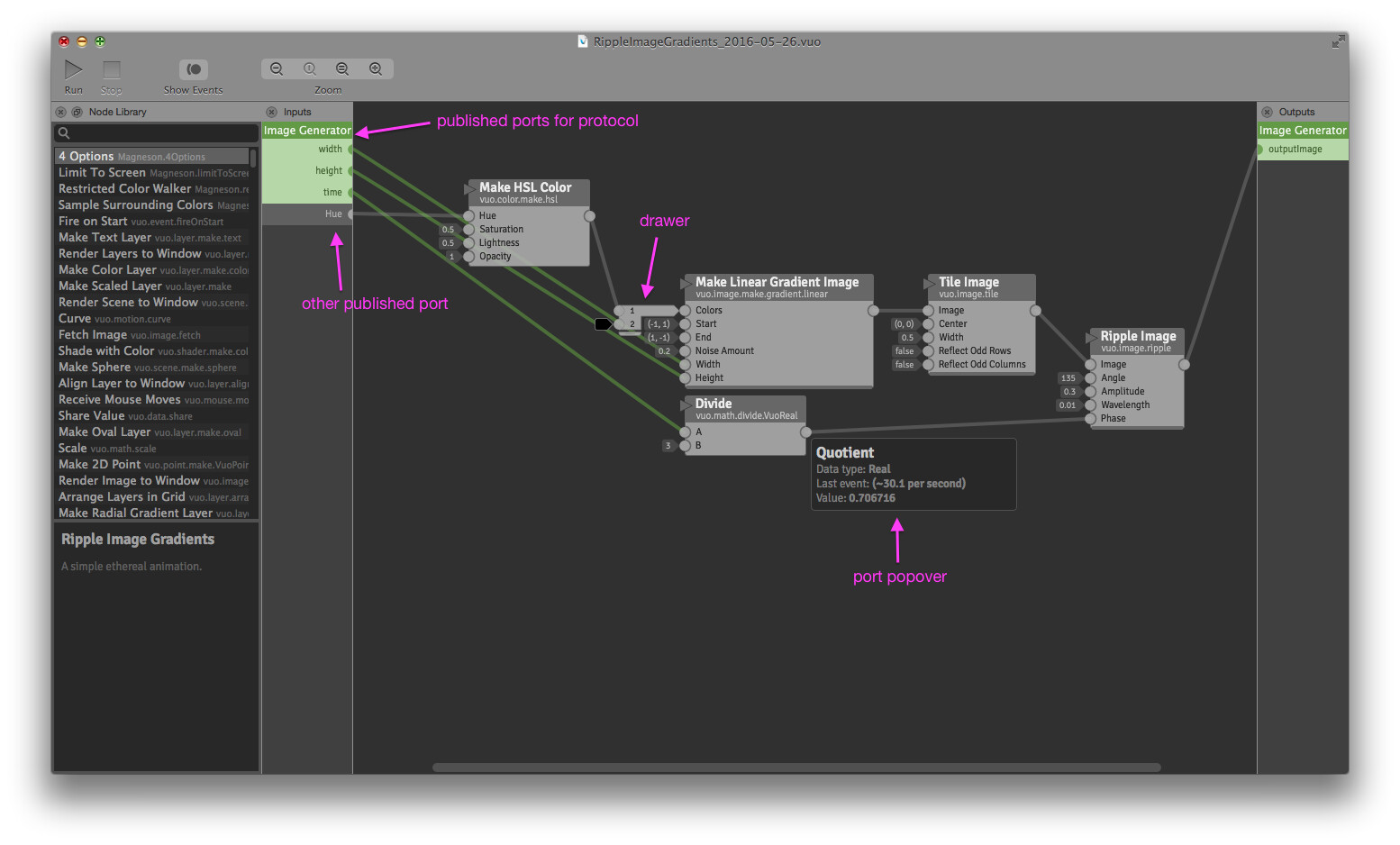
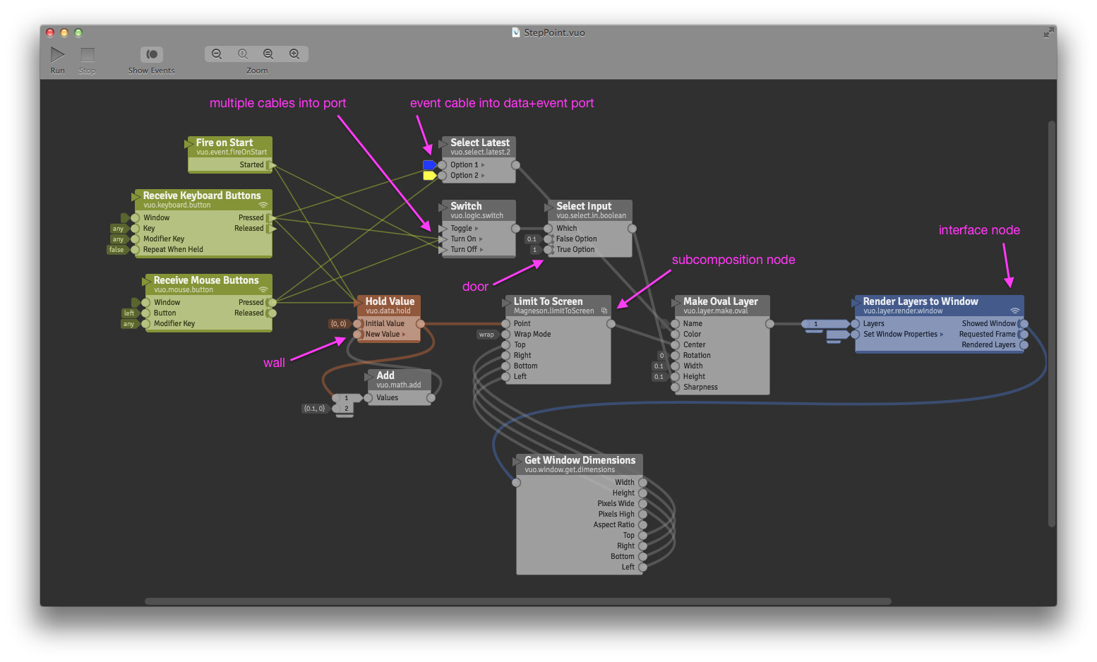
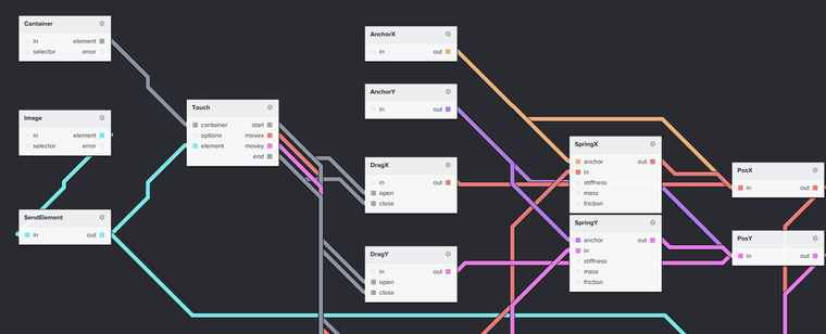
As promised, here are some compositions demonstrating various language features. What sticks out as needing a redesign? Mockups welcome :)
RippleImageGradients_2016-05-26.vuo (2.6 KB)
EnlargeMovie_2016-05-26.vuo (5.58 KB)
StepPoint.vuo (4.97 KB)
This is just a thought: the nodes in this example are connected with cables that are bending all over the place. Can any redesign of Vuo look at making cables bend cleaner when nodes are placed next to each other? Possibly more rounded less oval?
I think the big thing about square objects is that they can often work out having better performance and take less space.
I like how QC has the selectable drop shadows so that you can have a little variation between a totally flat look, and something with a bit more depth.
My personal preference would be for things to look and work as closely to QC as possible. If not that, as most efficiently as possible while still being legible. The current editor look is pretty good, and I have enjoyed the refinements over time.
I personally think that the feature set and efficiency of compositions is a million times more important. :-) I may be jaded, but I think about music forums where people go on about plugin and DAW GUIs for eons instead of just making some music.
One thing that I think of all the time when using VUO, is that I sort of wish that different types of objects were just colored by defaults instead of there being an option to color code things any which way.
What happens is that all of these colors would seem to indicate some sort of info, and the eye (and my mind!) winds up being burdened by them slightly because they don’t really mean anything. It creates a type of visual clutter, at least for me.
It is possible I may have suggested some customization ability like that at some point, but after experiencing it, I realize it was not a good idea. Not a really big deal though.
Just wanted to share some screenshots of the sexiest nodes / cables IMHO ;)
I just hope Vuo in some future to be as nice as those (incrementally parallel to efficiency and futures)
FlowHub
NoFlo
Pd in some dark mode
@Bodysoulspirit, good to know. If you have time, I’d be interested if you could deconstruct some of what you like about them / why they’re appealing from a design perspective.
@Bodysoulspirit, good to know. If you have time, I’d be interested if you could deconstruct some of what you like about them / why they’re appealing from a design perspective.
;) Good question.
I like the colors they are using. So it seems colors are really important.
I like how PD and Noflo gave if a SciFi movie look, thanks to the colors, Noflo also thanks to some very elegant and thin design. A sense of depth.
I like all the cable curves of all the screenshots (PD like Vuo, the beziers of Flowhub, the Metro navigation map of NoFlo).
The nodes of Flowhub are quite classy. Don’t like the big icons on them though. Like the colors.
Noflo chose square. I think they look quite clear and consistent.
The thing however is that all of the screenshots have the ports info inside their nodes, like QC, unlike Vuo. That makes the Vuo node redesign a bigger challenge in my opinion. But the Vuo ports are handy !
So PD is very simple, Noflo is quite bold, Flowhub is very classy. All have a technology feeling and nice colors.
Vuo will be a mix of all these ;)
Concerning your 2016.05.27 comment, I’d say principally the hidden cables symbols and the drawers are in need of a redesign. A little bit the sidebars too.
The rest is way less important for now IMO !
Update on fonts…
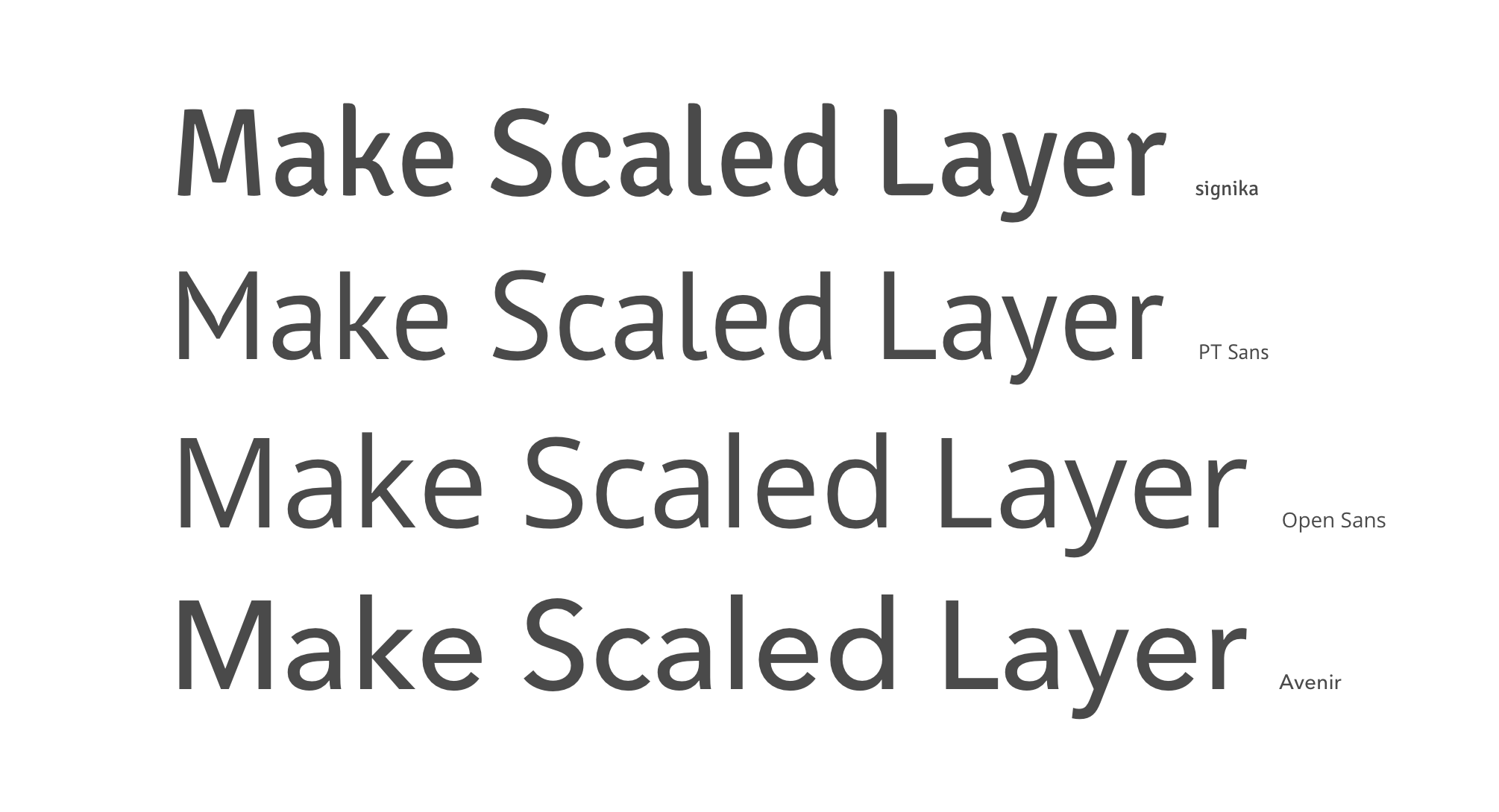
We tried out the fonts that people had suggested on this thread as a substitute for Avenir. Here’s a comparison of those fonts, along with the current font (Signika), at similar sizes:
Going by the criteria in the article suggested by @iason, we found that Signika, Karla, and Open Sans fared best. They have a pretty good lack of ambiguity between characters, a nice large x-height, and they don’t have stylizations that interfere with reading rhythm.
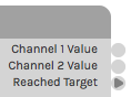
We ruled out Karla because it has proportional numbers instead of monospace. That’s not good for displays like port popovers where numbers are rapidly changing, since the width would be constantly shifting. It makes numbered ports misaligned:
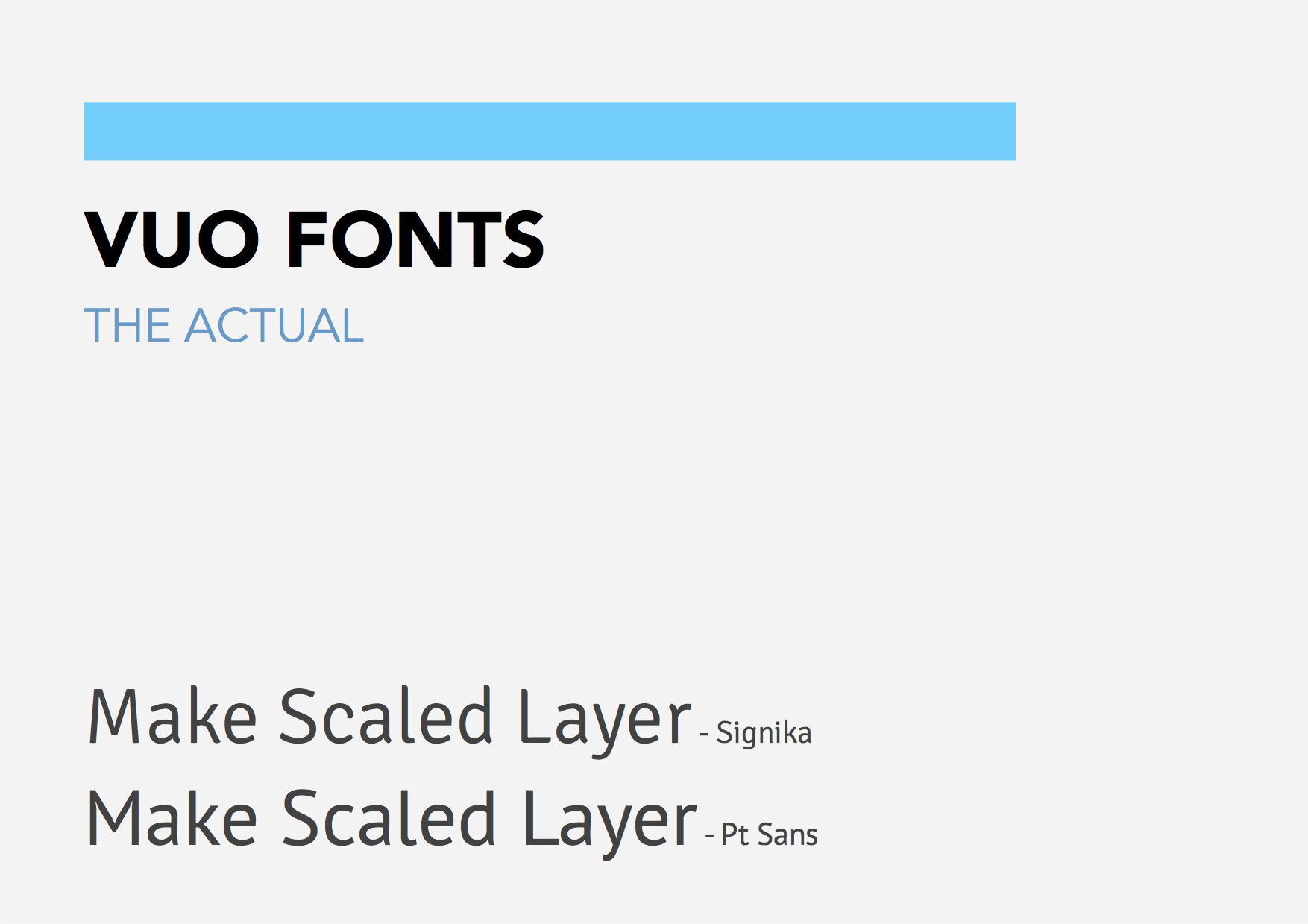
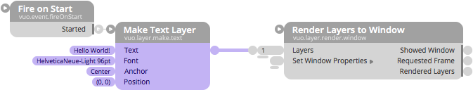
Here are mockups comparing Signika and Open Sans:
Signika:
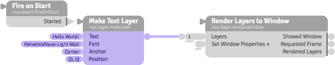
Open Sans:
Open Sans, like Avenir, seems wider and rounder than Signika. But, upon closer inspection, Open Sans has some issues with letter spacing. The “T” and “e” (Make Text Layer) seem too far apart, and the “S” and “h” (Showed Window) seem too mashed together.
We looked around for other fonts that designers describe as similar to Avenir. Based on the criteria, PT Sans seems pretty good:
What do y’all think of PT Sans?
Going by the criteria in the article suggested by @iason, we found that Signika, Karla, and Open Sans fared best. They have a pretty good lack of ambiguity between characters, a nice large x-height, and they don’t have stylizations that interfere with reading rhythm.
We ruled out Karla because it has proportional numbers instead of monospace. That’s not good for displays like port popovers where numbers are rapidly changing, since the width would be constantly shifting. It makes numbered ports misaligned:
Good to know Karla has non monospace numbers. Rules it out. Ikaros is way to stylish, I agree.
I agree less about Montserrat and Varela.
The article is great ! But I think some points to consider are that A - the article is from 2011 if I’m right, talking about low pixels density, which is not so much the case anymore B - That Vuo is mostly about nodes, not big paragraphs of text. So the font mainly should be tested on node mockups, like you guys did ;) So there are some differences.
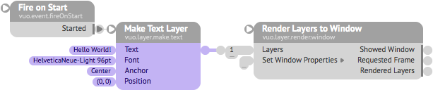
Here are mockups comparing Signika and Open Sans
Haha yeah cool ! Glad to see some mockups ! Are these drawings only or editor test screenshots ?
Signika seems slightly easier to read. I think that also comes from the fact that Signika is slightly bolder then Open Sans, and the letter spacing is a little bigger it seems.
Agree there is a small gap between the T and e, that doesn’t bother me too much though, I don’t really see the s and h merged.
Kernings in fonts are a thing. I see a small one in PT Sans between the a nd the k in “Make” too.
By the way, just a question, if a font came to have nice shapes, but with a letter spacing or a line spacing (not line-height) a little too large by default, can it not be reduced software-wide with a line of code ? Just a non-coder question.
We looked around for other fonts that designers describe as similar to Avenir. Based on the criteria, PT Sans seems pretty good.
;) I prefer Pt Sans to Signika, but somehow it’s still very close to Signika ! ;)
Not sure about the work vs the result in terms of differences with Signika. When you look at your two mockups, the difference is barely to notice IMO.
And the why becomes even clearer when zoomed a little ! If part of the goal is to reach somehow a modern font like avenir (god I love that font), then when aligned, Pt Sans clearly looks more to Signika, and Open Sans more to Avenir :
The way the lower tail of the “a and the d” serifs to the right, the way the bars of the “k” come out horizontally before splitting, the way lower “L” is serifed to the right f.e.
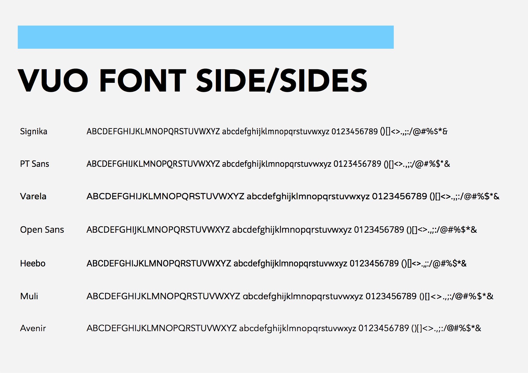
It made me want to check out some more Google fonts. Got some more (I’m including in the zip) below :
The first image is the actual font (+ Pt Sans as it’s quite close IMO), then the others, and even at the end, some full serif fonts. I mean, if serif, go full serif, until some technical retro feeling (like Flowhub) ;) A retro feeling, or a modern sans serif. Signika looks to kiddish to me, I would love Signika for some Kindergarten logo more (don’t take me bad at all eh, they’re perso tastes ;)
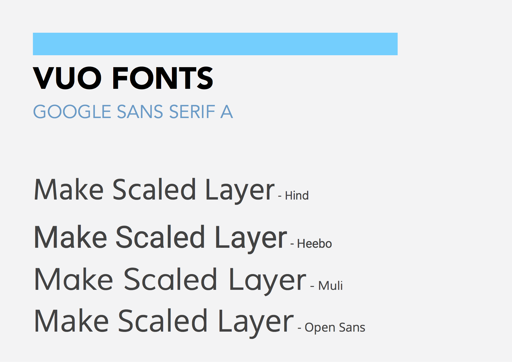
What do you guys think of Hind, Heebo and Muli ?
Here are their alphabet + how they look on some nodes
Some GIF os some zoom (individual frame images in the .zip) :
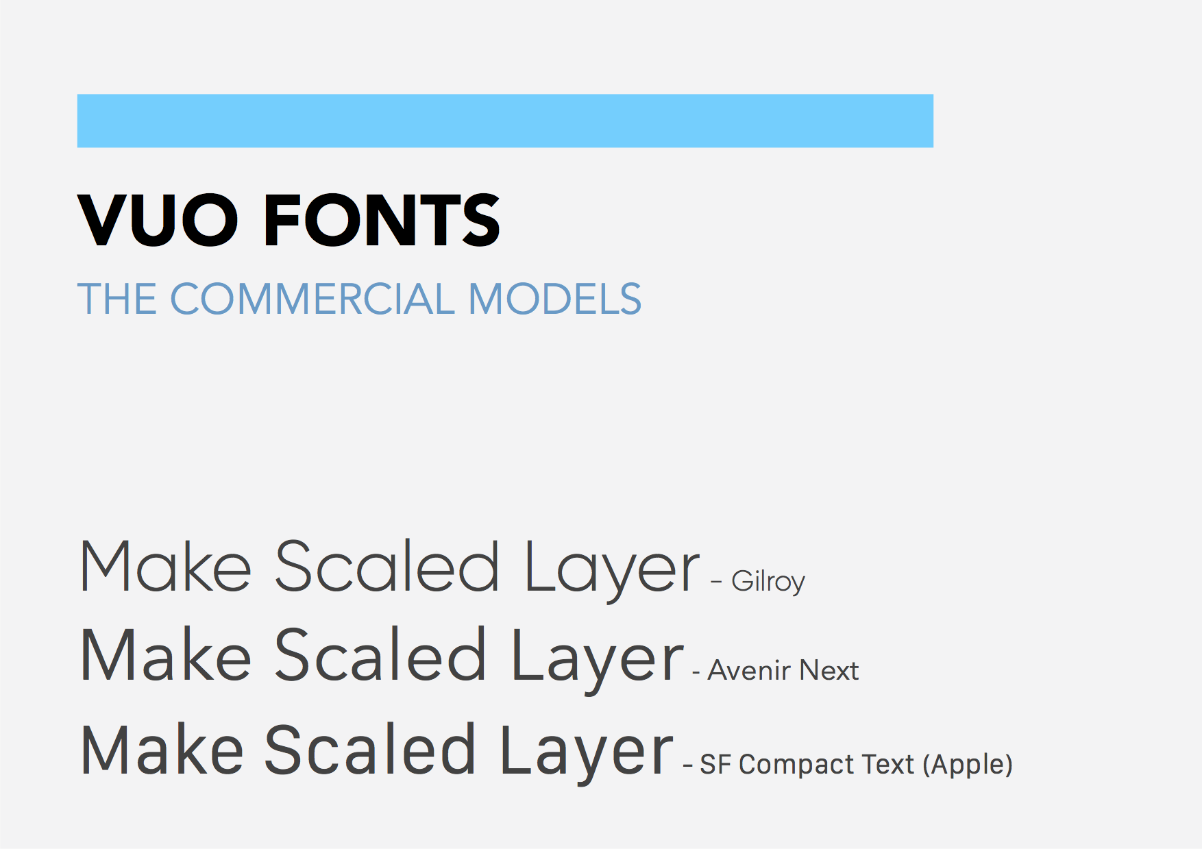
PS : Gilroy is a nice commercial font. I sent an email for the price license, that website did not sell desktop app licences, only mobile app ones, at about 1200 $ :( So. Will still perhaps ask for the desktop, asking costs nothing ;)
Fonts 2016:08:25 - Stuff.zip (6.43 MB)
We ruled out Karla because it has proportional numbers instead of monospace. That’s not good for displays like port popovers where numbers are rapidly changing, since the width would be constantly shifting. It makes numbered ports misaligned
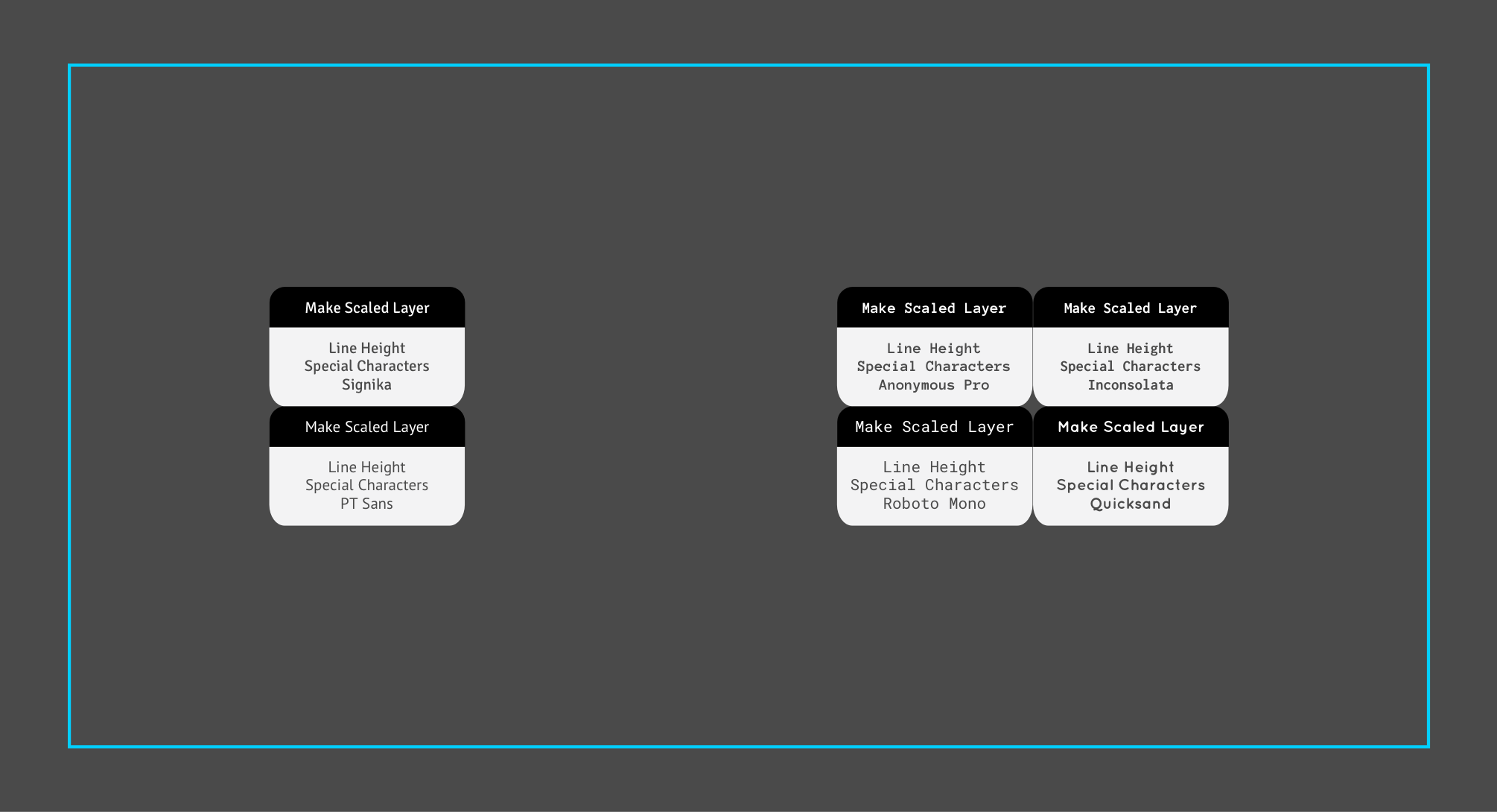
So it seems that Hind, Montserrat (and Quicksand) would be dropped too then. So the number-monospaced fonts that would remain :
Signika
PT Sans
Varela
Open Sans
Heebo
Muli
Or commercial fonts
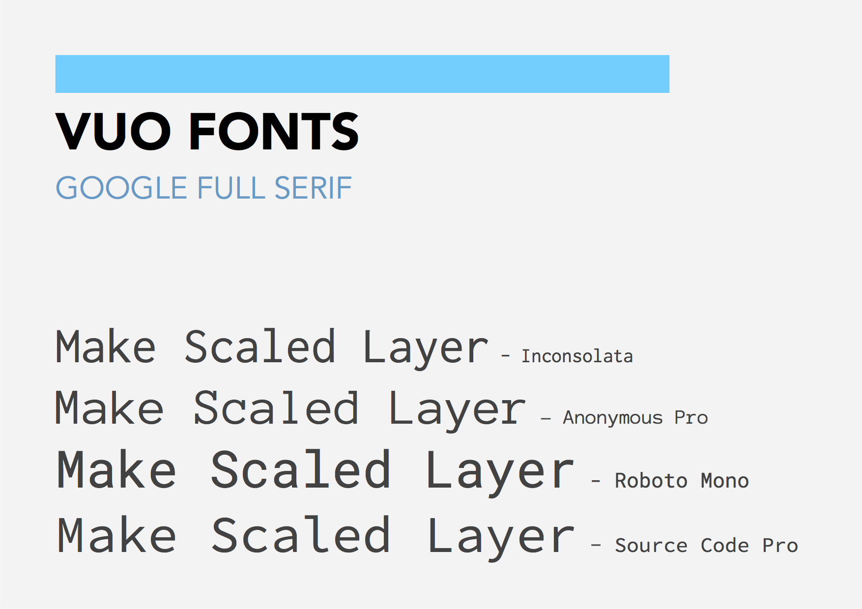
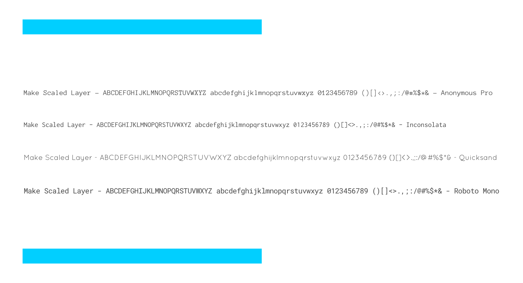
(And full serif Anonymous Pro, Inconsolata and Roboto Mono)
And this point I personally don’t know which of the remaining fonts I prefer. I will try to make a deeper comparison of the fonts and upload some images again for everybody to choose easier if that’s ok, unless the team already has chosen and defined they really want to use PT Sans of course.
Ok I’ve been trying to compare them deeper.
For a better analyze I have opened the fonts with a font creation app named Glyphs Link (they have a 30 day full trial demo if you came to want try it).
So Montserrat and Hind definitely not have monospaced numbers.
So here is what we could get :
The app allows to retrieve more info about the fonts too. However, I’m not a real font pro, so there may be errors :
Styles : The number of styles each font has, don’t know how much Vuo would require :
Signika = 4
PT Sans : 2 normal + 2 italic
Varela : 1
Open Sans : 5 normal + 5 italic
Heebo : 7 normal
Muli 2 normal + 2 italic
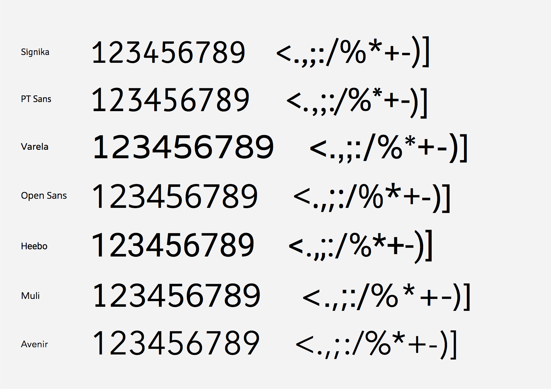
Monospace (character same size) :
Numbers : Yes, all (except Muli, it has 1 point difference on some numbers, with some negative bearings).
Letters : None of the above font list, the full serif monospace retro fonts do.
Kernings (specific rules of distances between some specific characters, f.e. VA) :
On Numbers : No, none.
On Letters :
Yes : PT Sans, Heebo.
No : Signika, Varela, Open Sans, Muli.
I did not know some fonts could not have any kerning pairs, however Glyph app says Signika, Varela, Open Sans an Muli have not (probably means they play with side bearings, that can be negative sometimes).
So the winners here would be :
Styles : Open Sans and Heebo.
Monospace : All win for numbers, except Heebo (though it’s a 1 point difference only), full monospace serif fonts would win here.
Kernings : I guess the less Kernings, the more average a word length, so probably Varela, Open Sans and Muli.
Now some other design comparisons :
Lowercase :
My personnal lowercase winners : Open Sans and Muli (Heebo is too bold for regular compared to others).
Love the shape of the Muli letters even more then Open Sans, moderner.
Numbers :
My personnal number winners : Open Sans, Heebo and Muli (Heebo and Muli a little more).
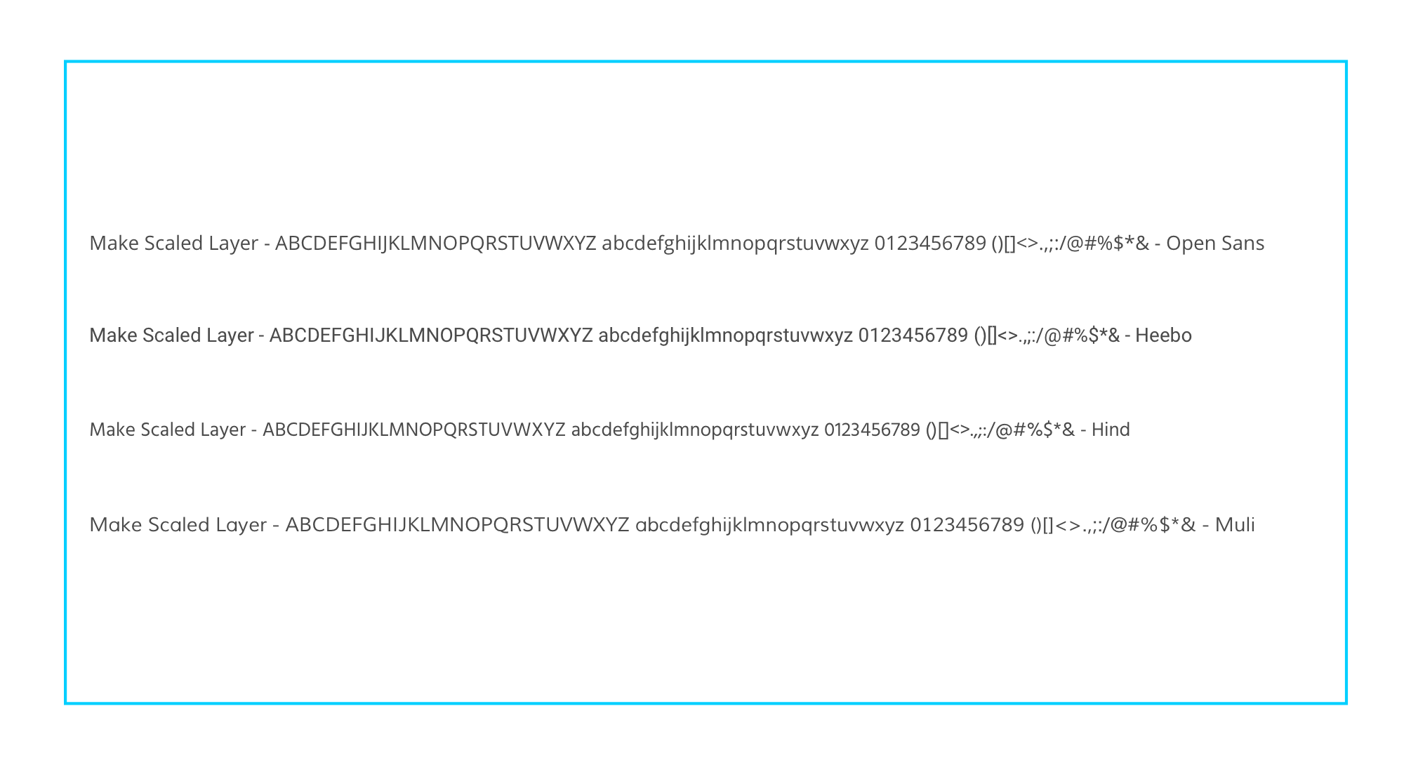
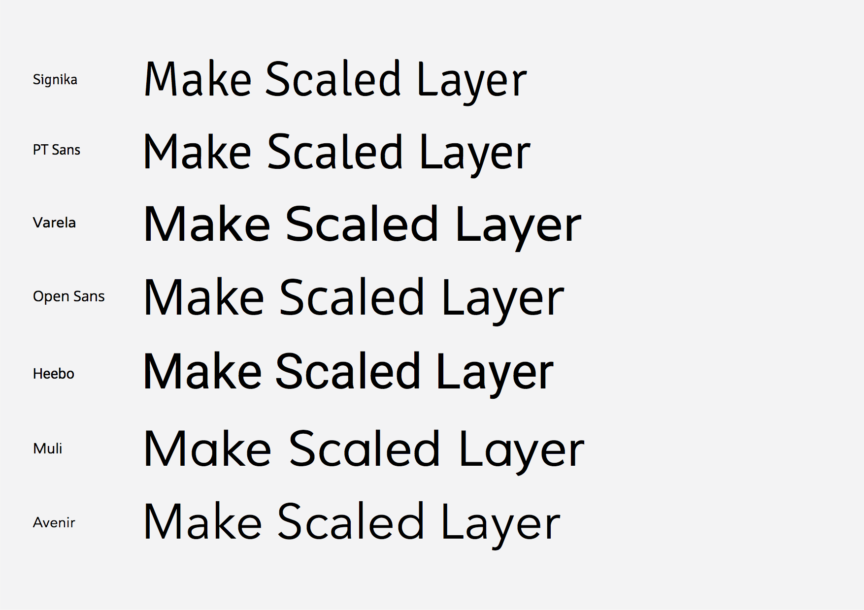
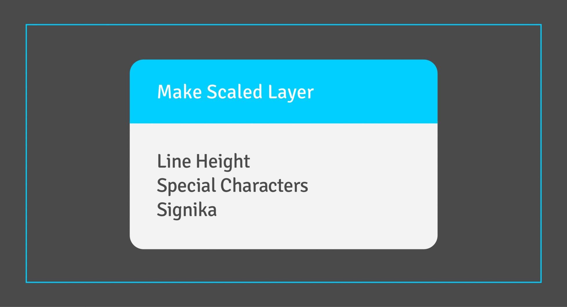
Make Scaled Layer (our local quick brown fox over the lazy dog) :
My personnal Make Scaled Layers winners : Open Sans, Heebo and Muli (Heebo and Muli more).
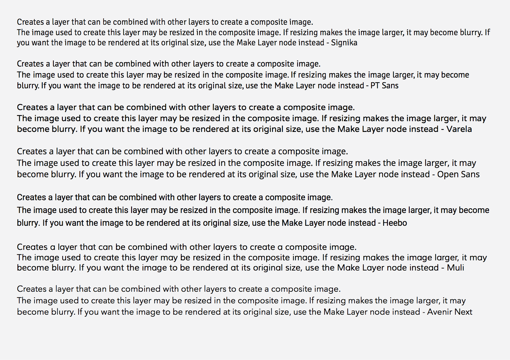
Node Info :
My personnal Node Info text paragraph winners : PT Sans and Heebo, Open Sans perhaps better if character spacing reduced a little or even the text size. Open Sans at the same size (all the images have the same text sizes each time) seems bigger, so it could probably be used smaller !
A reminder of the commercial fonts :
Well, all of them.
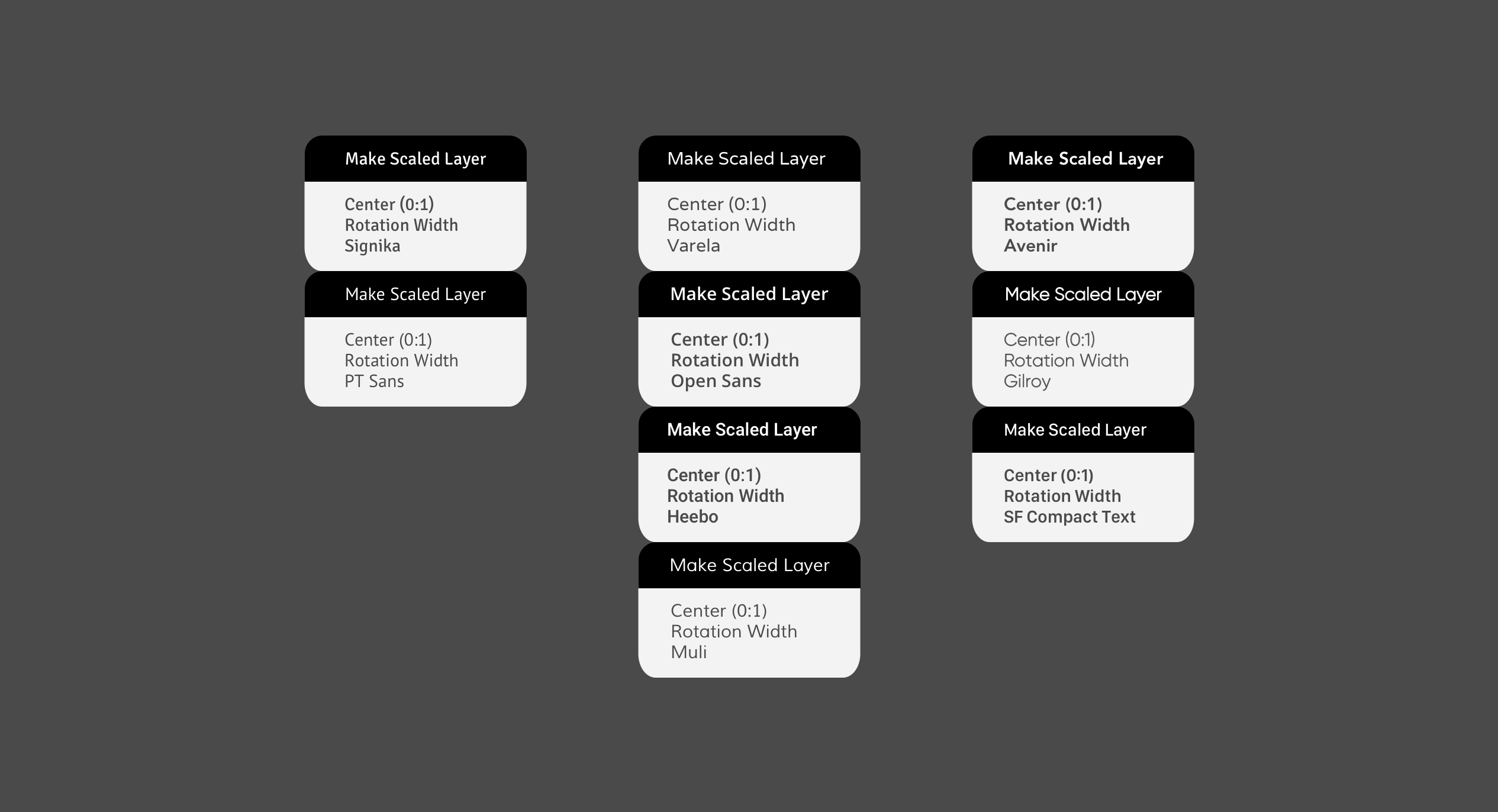
The nodes - The fonts on nodes :
a - Sans Serif
Winners : Open Sans and Heebo because they are bolder. Varela and Muli can’t match Signika because either to bold or to thin, with their limited styles.
Again, Open Sans could be reduced a bit.
b - Full monospace Serif
Winner : Probably Roboto Mono.
So to conclude, Open Sans and Heebo seem to pretty almost always do the job. I perhaps like Heebo more, but it should be tested regarding the kerning and the point difference in the numbers width.
Open Sans would probably be wiser (beside the fully monospaced fonts), Heebo a more dared option …
PS : Joining all the fonts, images and vector drawing sketch files (nodes) in the Font Stuff 20160830.zip (2.3 MB).
Thanks for the thorough review, @Bodysoulspirit! Some of the team talked over fonts again today, including the helpful comparisons that you put together.
Any of multiple of these fonts could be a good choice for Vuo. They score well in the criteria for legibility. To some extent, the choice is a matter of personal preference.
We did some more web searching and found that both Open Sans and PT Sans appear in numerous designers’ lists of the best sans-serif web fonts. Those were our top contenders as a replacement for Signika.
That Vuo is mostly about nodes, not big paragraphs of text.
The same font would be used throughout the Vuo Editor UI — not just nodes, but also the node descriptions in the lower pane of the node library (i.e., paragraph text). Ideally, we’d use the font for the user manual and website as well.
After delving into the differences between the fonts, we discovered a couple of main reasons that we prefer PT Sans over Open Sans:
We’re pretty happy with PT Sans, so we’ve decided to go with that.
We’re pretty happy with PT Sans, so we’ve decided to go with that.
Ok. Smaller step, but a step though ;)
Kind of like how the bigger contrast between node header and node body turned out.
A lighter gray by default for the body, and a darker (here black) header gives it a classy look.
But the background here is brighter then dark mode in Vuo, and a too bright body would not be distinguished enough on the white canvas.
It should of course be tested with the other port elements (drawers, ports etc) before claiming this looks good, but just as an idea to test, when fine tuning the colors, perhaps check how bright you could set the default body gray, and how dark the header (unless you’d try the same color for body and header).
A lighter gray by default for the body, and a darker (here black) header gives it a classy look.
Interesting. We’ll try it out.
Ideally, we’d use the font for the user manual and website as well.
There’s really good reasons for not plumping on a single font and using it everywhere, though I see IT folks deploy that strategy all the time.
It’s to do with visual hierarchy and differentiation. Also longer text (think Vuo Manual) can suit slab-serif or even old school serif fonts, though the current choice in Manual possibly doesn’t make Vuo look to state-of-the-art-video-arts-tool.
I’m glad to see this font discussion happened in my absence. I think Open Sans was one I had suggested a long time ago, or maybe it was Adobe’s free Sans font.
On the issue of monospaced numeral glyphs, as long as the licence allows, I can’t see any reason why the existing numbers couldn’t be repeated elsewhere in the font as monospaced, and glyph substitution occur on the fly. InDesign can be told to substitute this glyph for that in same font for any given text frame and it just works. Maybe a bit extra coding involved, not as easier for sure.
Visual hierarchy is really important and at the centre of my grief on the Vuo editor (but also it’s an aesthetic sensibility). Over emphasising difference can be just as problematic as under-representation of differences (i.e Node Title and Input Port Labels), I usually go for understated over too much emphasis but I would definitely considering using a slightly heavier font weight for the title than Input port labels. That might be hard with these free fonts, they tend not to come with 5-10 different weights like commercial fonts. It looks like I can find a bit of time in the summer break here to dig out my old design ideas so I’ll post for further grist to the mill.
Including a response to an old comment I just re-read:
I think people nowadays care about how a software looks. Branding has never been more important than today. I see it in all the new softs coming out. Sketch for example, compared to Illustrator. Recent designer love how Sketch looks like and love how easily some things can be achieved compared to Illustrator.
And Illustrator looks pretty dam fine compared to Vuo from my perspective. It’s not just looks though, it’s usefulness and a term I use often with clients: ‘visual hierarchy’. Order applied to the apparent chaos of graph programming!
Our brains are very efficient pattern recognition machines, not to mention well conditioned to state-fo-the-art UI on some of the Mac software for decades now and we can either work with that conditioning and processing power or confound it. Vuo is currently in the ugly duckling stage and it’s also confounding for readability and recognition. But the beziers curves on wires simply must com in at perp to the vertical for this thing to look sweet I think. Even if that first FlowHub example with the green noodle coming in and out at 45º looked reasonably cool.