Ok I’ve been trying to compare them deeper.
For a better analyze I have opened the fonts with a font creation app named Glyphs Link (they have a 30 day full trial demo if you came to want try it).
So Montserrat and Hind definitely not have monospaced numbers.
So here is what we could get :
The app allows to retrieve more info about the fonts too. However, I’m not a real font pro, so there may be errors :
Styles : The number of styles each font has, don’t know how much Vuo would require :
Signika = 4
PT Sans : 2 normal + 2 italic
Varela : 1
Open Sans : 5 normal + 5 italic
Heebo : 7 normal
Muli 2 normal + 2 italic
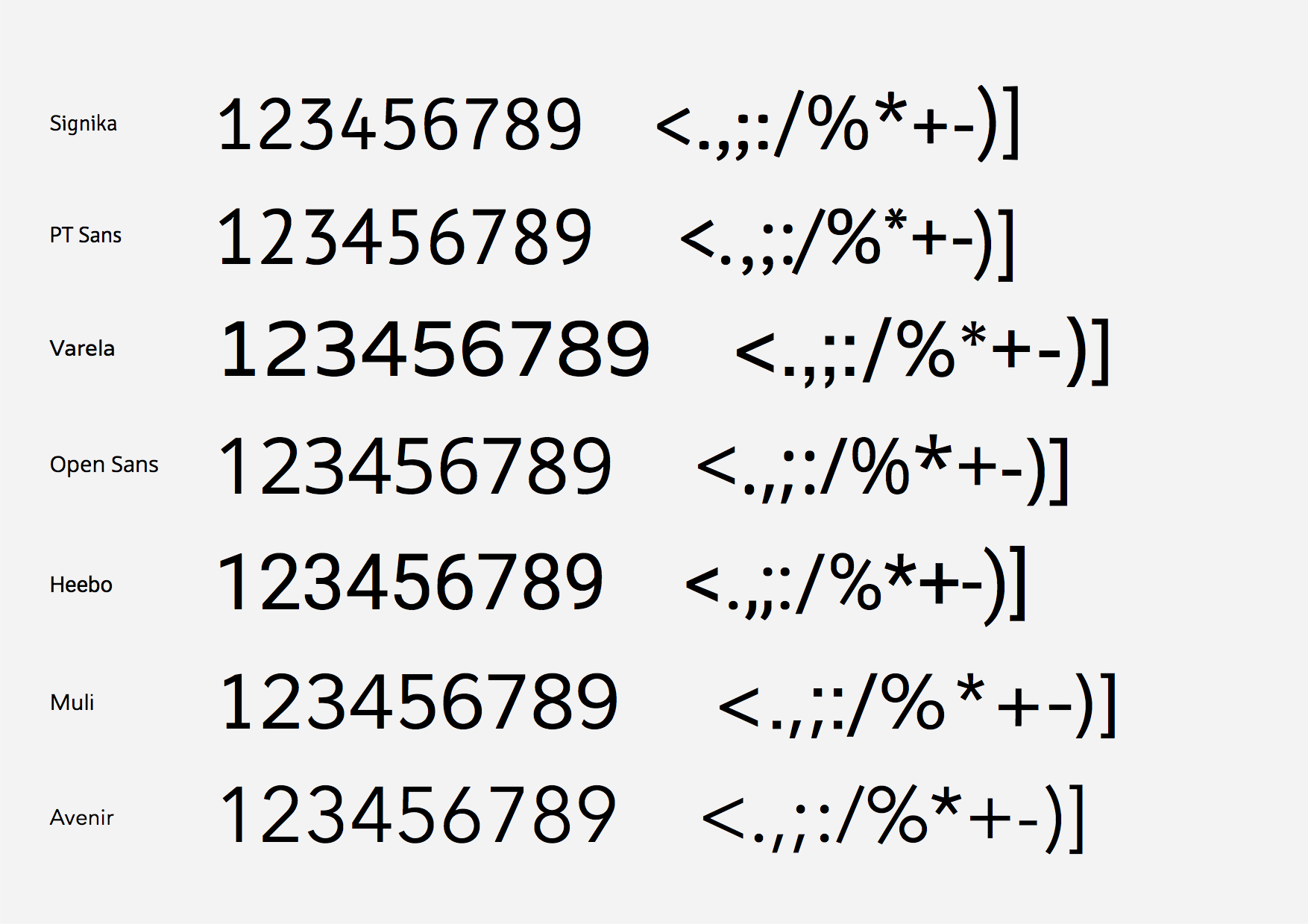
Monospace (character same size) :
Numbers : Yes, all (except Muli, it has 1 point difference on some numbers, with some negative bearings).
Letters : None of the above font list, the full serif monospace retro fonts do.
Kernings (specific rules of distances between some specific characters, f.e. VA) :
On Numbers : No, none.
On Letters :
Yes : PT Sans, Heebo.
No : Signika, Varela, Open Sans, Muli.
I did not know some fonts could not have any kerning pairs, however Glyph app says Signika, Varela, Open Sans an Muli have not (probably means they play with side bearings, that can be negative sometimes).
So the winners here would be :
Styles : Open Sans and Heebo.
Monospace : All win for numbers, except Heebo (though it’s a 1 point difference only), full monospace serif fonts would win here.
Kernings : I guess the less Kernings, the more average a word length, so probably Varela, Open Sans and Muli.
Now some other design comparisons :
Lowercase :
My personnal lowercase winners : Open Sans and Muli (Heebo is too bold for regular compared to others).
Love the shape of the Muli letters even more then Open Sans, moderner.
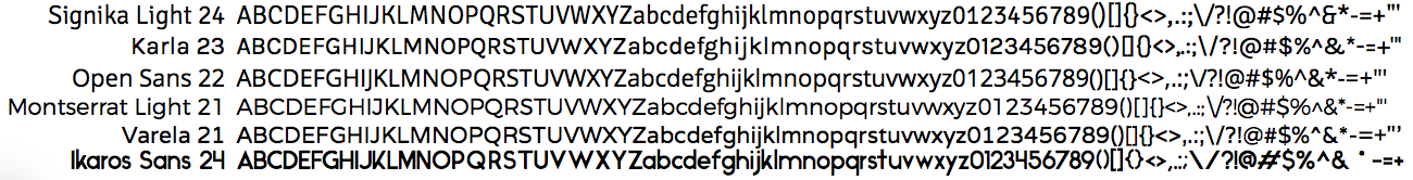
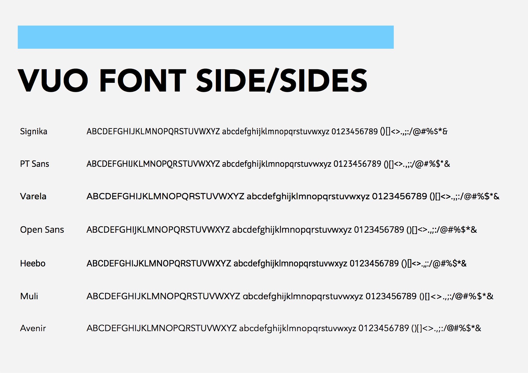
Numbers :
My personnal number winners : Open Sans, Heebo and Muli (Heebo and Muli a little more).
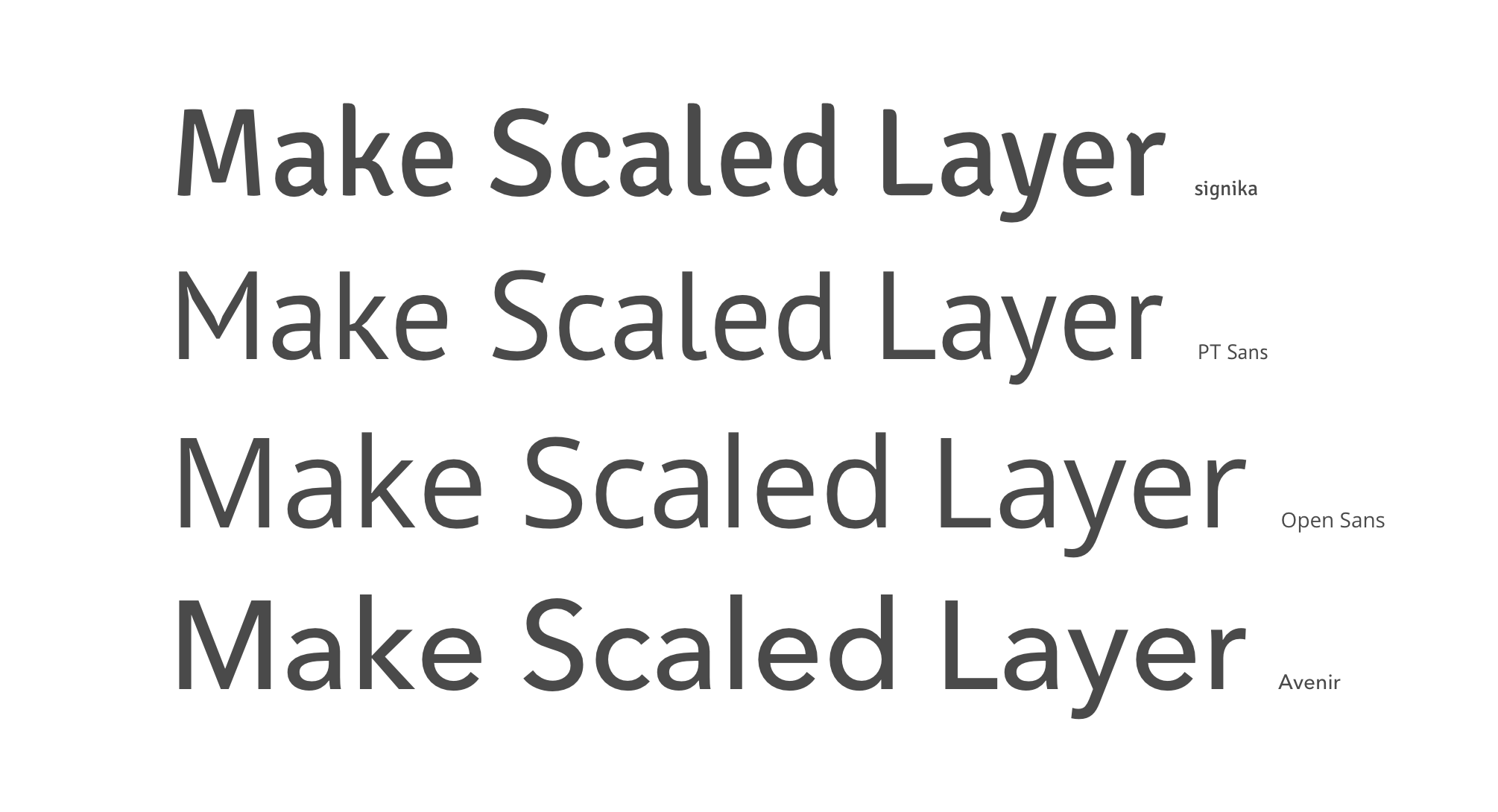
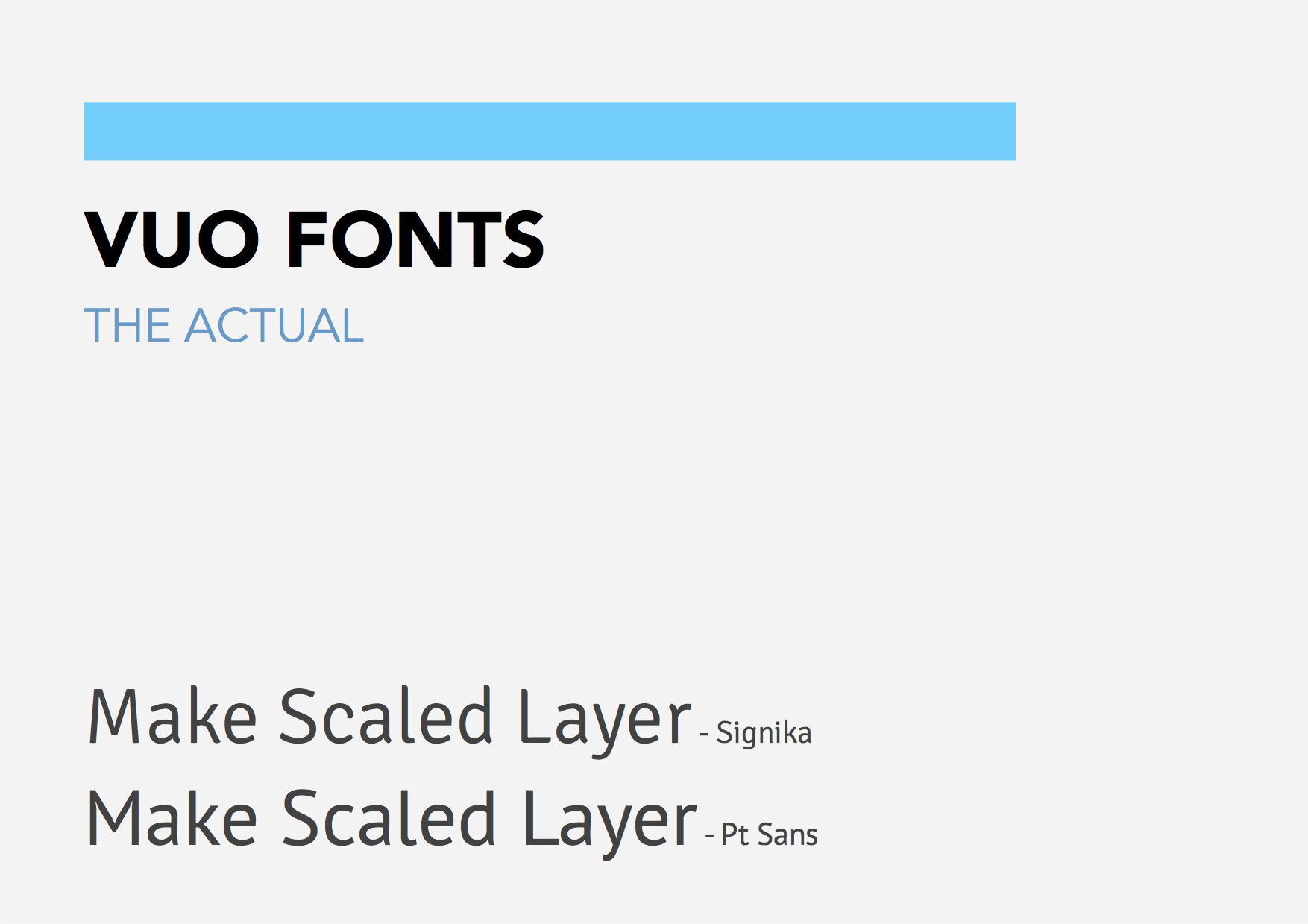
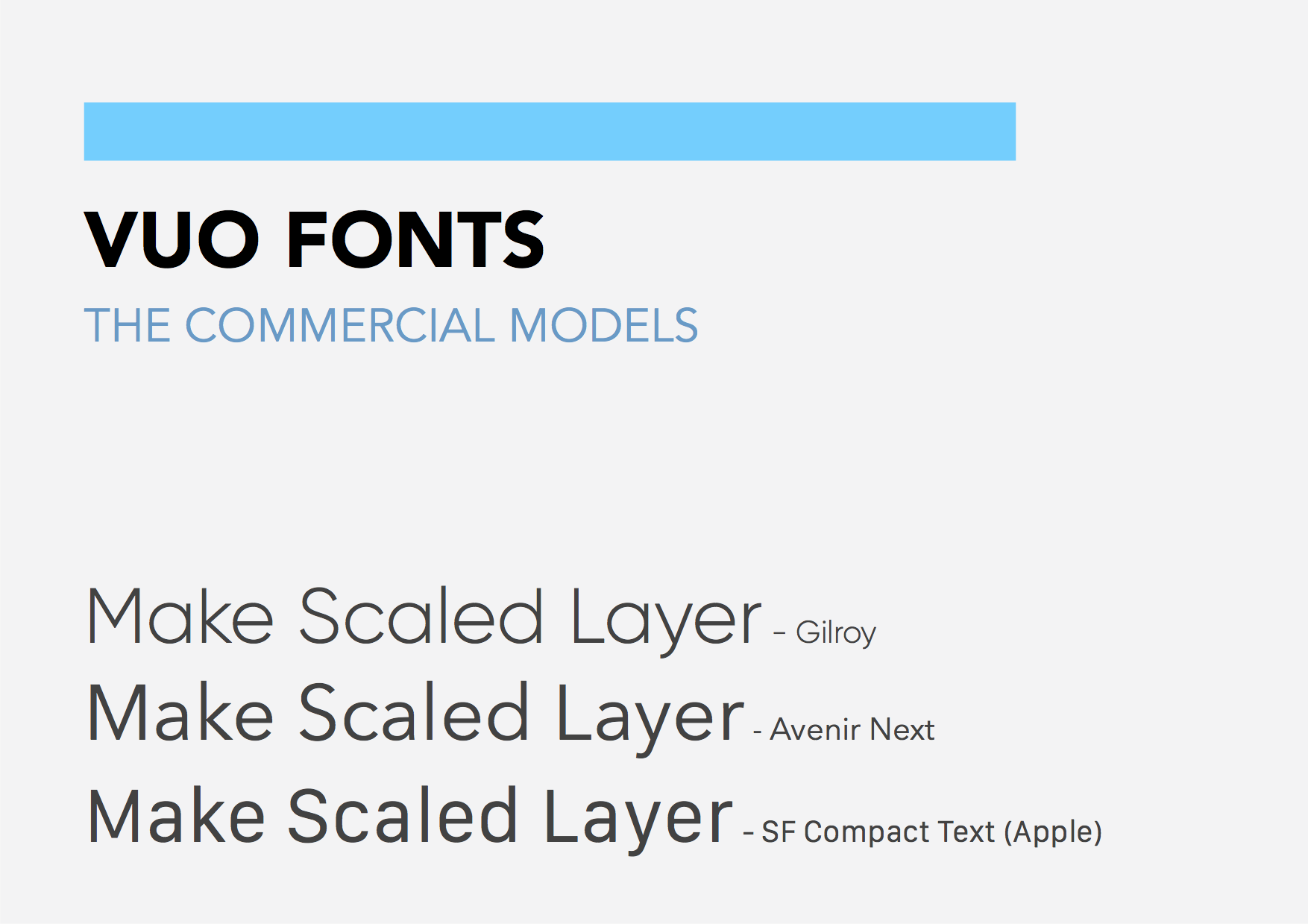
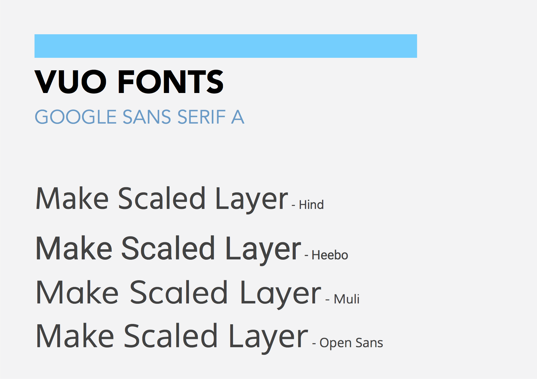
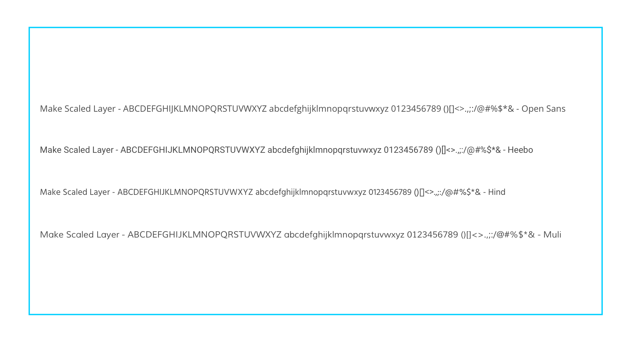
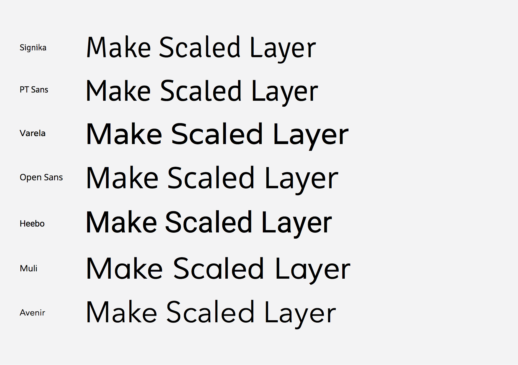
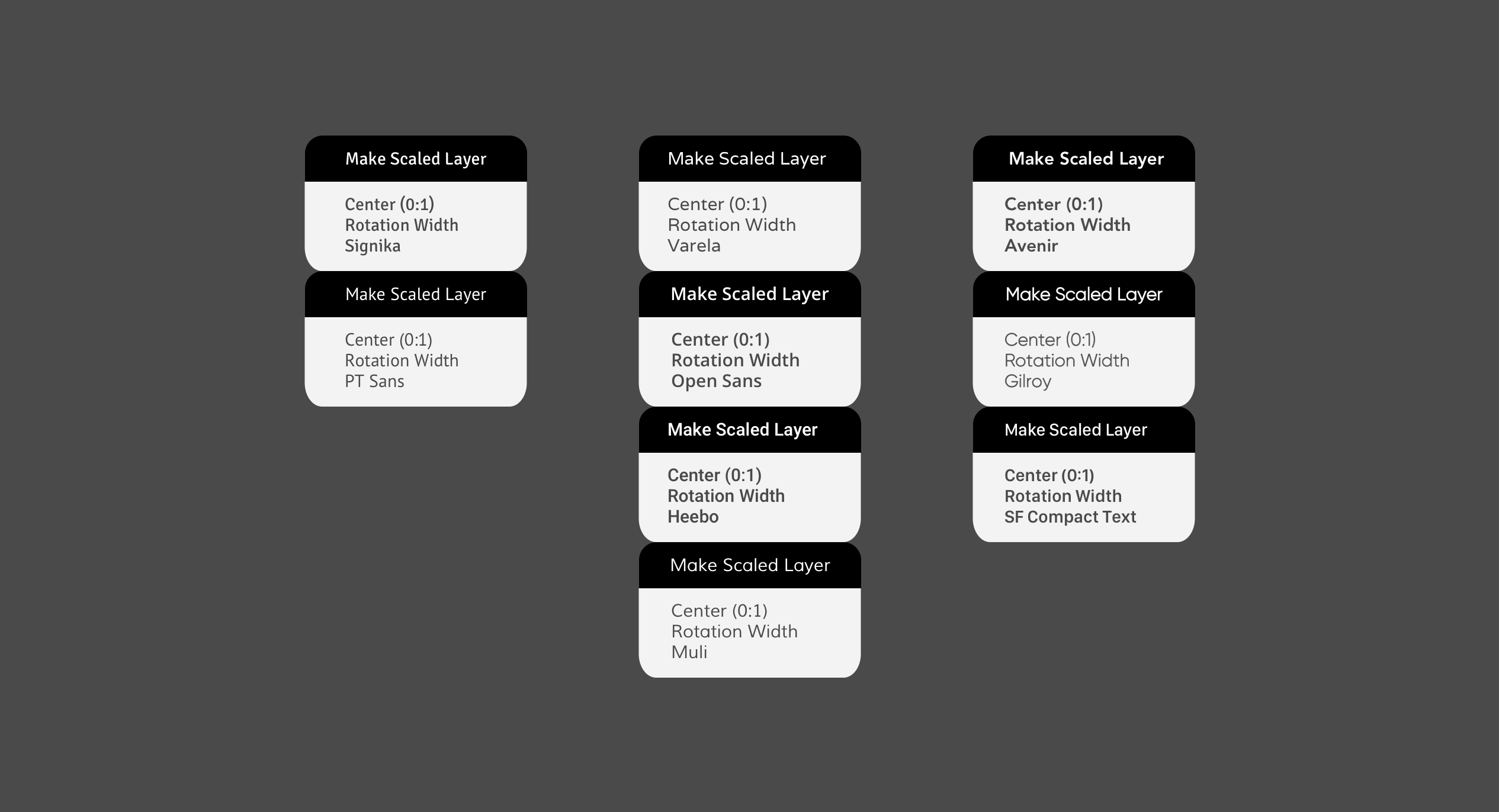
Make Scaled Layer (our local quick brown fox over the lazy dog) :
My personnal Make Scaled Layers winners : Open Sans, Heebo and Muli (Heebo and Muli more).
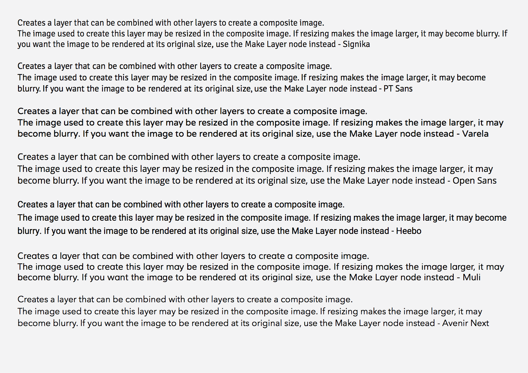
Node Info :
My personnal Node Info text paragraph winners : PT Sans and Heebo, Open Sans perhaps better if character spacing reduced a little or even the text size. Open Sans at the same size (all the images have the same text sizes each time) seems bigger, so it could probably be used smaller !
A reminder of the commercial fonts :
Well, all of them.
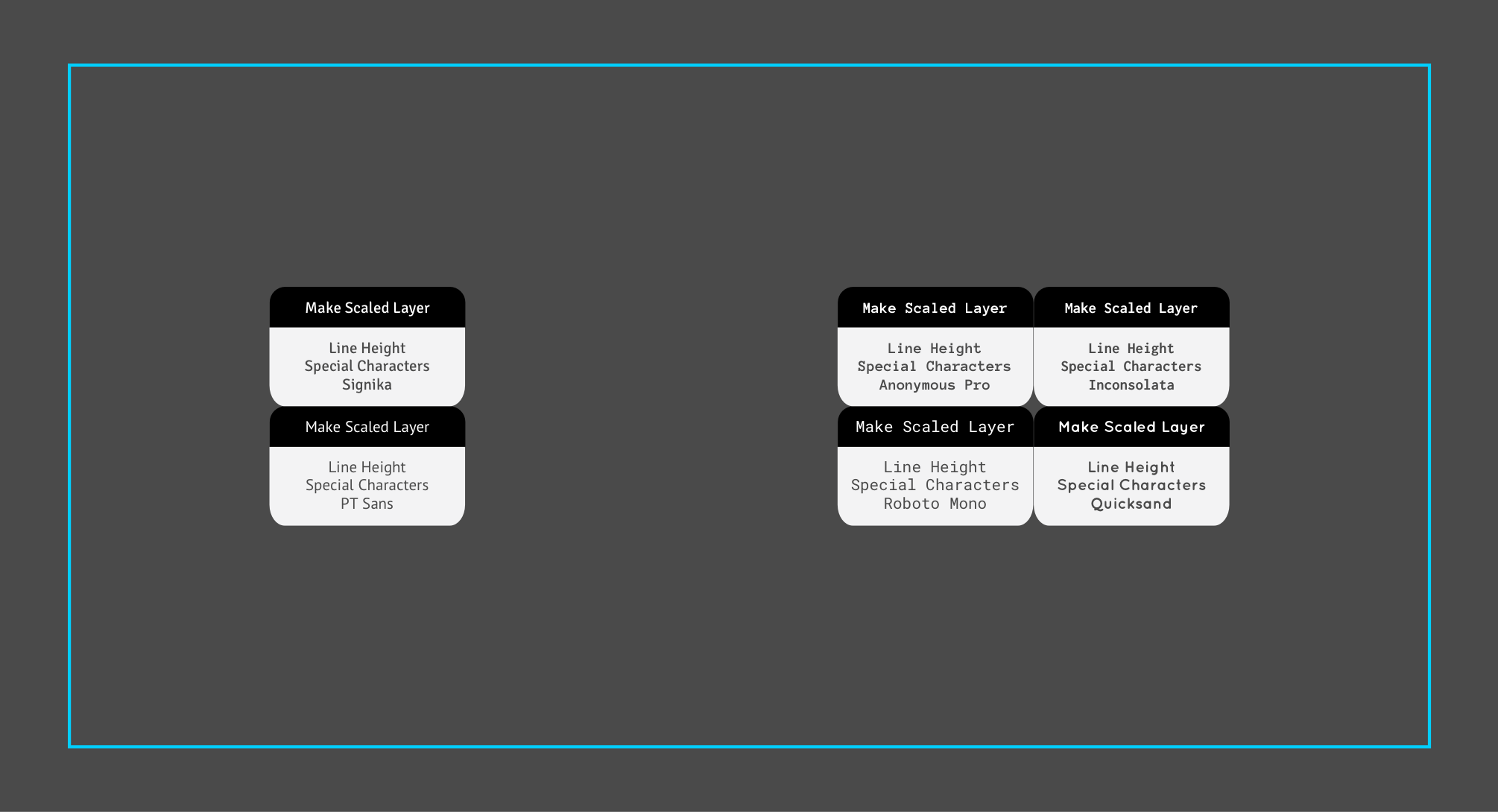
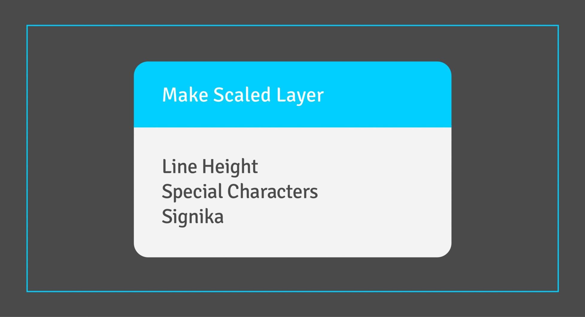
The nodes - The fonts on nodes :
a - Sans Serif
Winners : Open Sans and Heebo because they are bolder. Varela and Muli can’t match Signika because either to bold or to thin, with their limited styles.
Again, Open Sans could be reduced a bit.
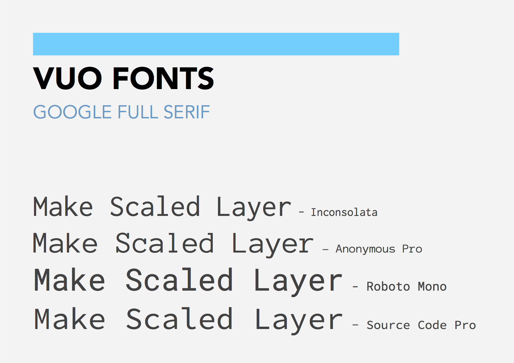
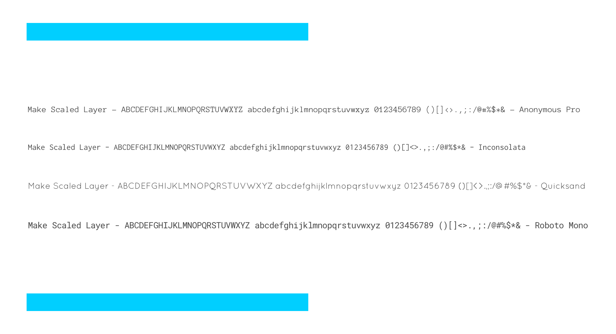
b - Full monospace Serif
Winner : Probably Roboto Mono.
So to conclude, Open Sans and Heebo seem to pretty almost always do the job. I perhaps like Heebo more, but it should be tested regarding the kerning and the point difference in the numbers width.
Open Sans would probably be wiser (beside the fully monospaced fonts), Heebo a more dared option …
PS : Joining all the fonts, images and vector drawing sketch files (nodes) in the Font Stuff 20160830.zip (2.3 MB).